
While the climate mainstream papers continue to assert persistent Antarctic Warming [1,2], the satellite data shows that Antarctica and its surrounding waters have been cooling over the entire satellite era, which is recognized to have started in 1979. A narrow trail of peer reviewed papers {3,4] also discern that the sea ice which surrounds the Antarctic continent, has expanded over the past 40 years.
The Antarctic latitudes have been cooling, and so the sea ice around Antarctica has been expanding.
The satellite data also corroborate a warming Northern Hemisphere with amplification at its pole. This however is the same data that support that Antarctica has been cooling. To be clear, warming at one pole and cooling at the other are both simultaneously possible and that appears to be what the satellite data signify.
Satellite evidence of long term cooling, and of long term expanding ice, and of a long term drop in seasonal melting, support an interpretation that Antarctica and its surrounding Southern Ocean, have been getting colder and not warmer. Satellite data also support that the Arctic has been warming, and that much of the planet’s latitudes in between the two poles have maintained a remarkably stable temperature regime.
The satellite CO2 data also might pose a challenge to prevailing assertions and bean-counting of where in the world the CO2 is coming from and going to. If only we could see all of the CO2 data from the satellites for this region for all of the months of the satellite era, that might add value to any interpretation. But there are blushingly wide and well-ventilated gaps in this information.
THE GREENHOUSE GAS THAT FORGOT TO WEAR PANTS
Is there any satellite information resource for the atmospheric concentration of carbon dioxide below about 60S latitude? That’s a sixth of our planet’s surface area. Without those missing latitudes, no one can claim to know what the average CO2 concentration for the planet actually is. This data would also be critical in regard to global carbon cycling and subsequent mass accounting of CO2 in the atmosphere and distribution among all sources and sinks.
There are a handful of land stations surrounding that continent and a few in its interior that measure this gas. But those are the same stations that report a warming Antarctica (see above), in direct contradiction to the satellite data. And peer review features of satellite-based CO2 across our planet, even north of these southern latitudes, have not been published for almost 5 years.
It’s all about satellite data now.
Both of these topics have developed from satellite perspectives that overlap the Antarctic (or would if the data were available). Satellite atmospheric coverages, unlike some examples of land data, or of models, appear to be difficult to bend to preconceived notions. But as you can see, the satellite results can be diminished and/or withheld, apparently without troubling any conventional climate scientist or journalist or lawmaker.
I’m looking forward to any updates which help resolve the two current opposing narratives, starting with that of emissions based climate change:
- Antarctica is warming at an accelerated pace.
- Its ice is melting at an accelerated pace.
- There’s nothing worth reporting about sea ice extents surrounding Antarctica
- CO2 is rising around the world including Antarctica.
- They have accounted for all CO2 concentration patterns in our atmosphere, as well as all sources and sinks, and this information is up to date.
In contrast, here is what the data and research appear to indicate:
- Antarctica has been cooling over the past 40 years.
- Its continental ice sheet has been stable.
- The surrounding sea ice has been expanding over the past 40 years.
- There are no published satellite data on CO2 over Antarctica or the surrounding Southern Ocean.
- There are no published satellite data on global or semi-global CO2 for any times after 2017. Given this gap and the previous bullet, it is impossible to accurately account for the CO2 patterns in our atmosphere.
Both lists cannot be right. At least, for what it is worth, I’ve continued to benchmark satellite temperatures against land station temperatures. Most if not all comparisons I’ve made show impressive alignments. In contrast, the fact that climate scientists maintain one set of alarming CO2 assertions while the satellite data indicates something else, appears to signify a dramatic failure in quality assurance (QA) practices. Epic policies hang in the balance.
And Quality Assurance best practices
The current pants-free greenhouse gas accounting systems are already being rapidly integrated into publicly traded corporations [6]. Therefore, if the satellite data were to be finally recognized, it would follow that shareholders and others might develop concerns. In prudent anticipation of the kinds of audits that most scientists and engineers already comply with, perhaps all climate researchers could consider making timely and comprehensive QA a priority starting today.
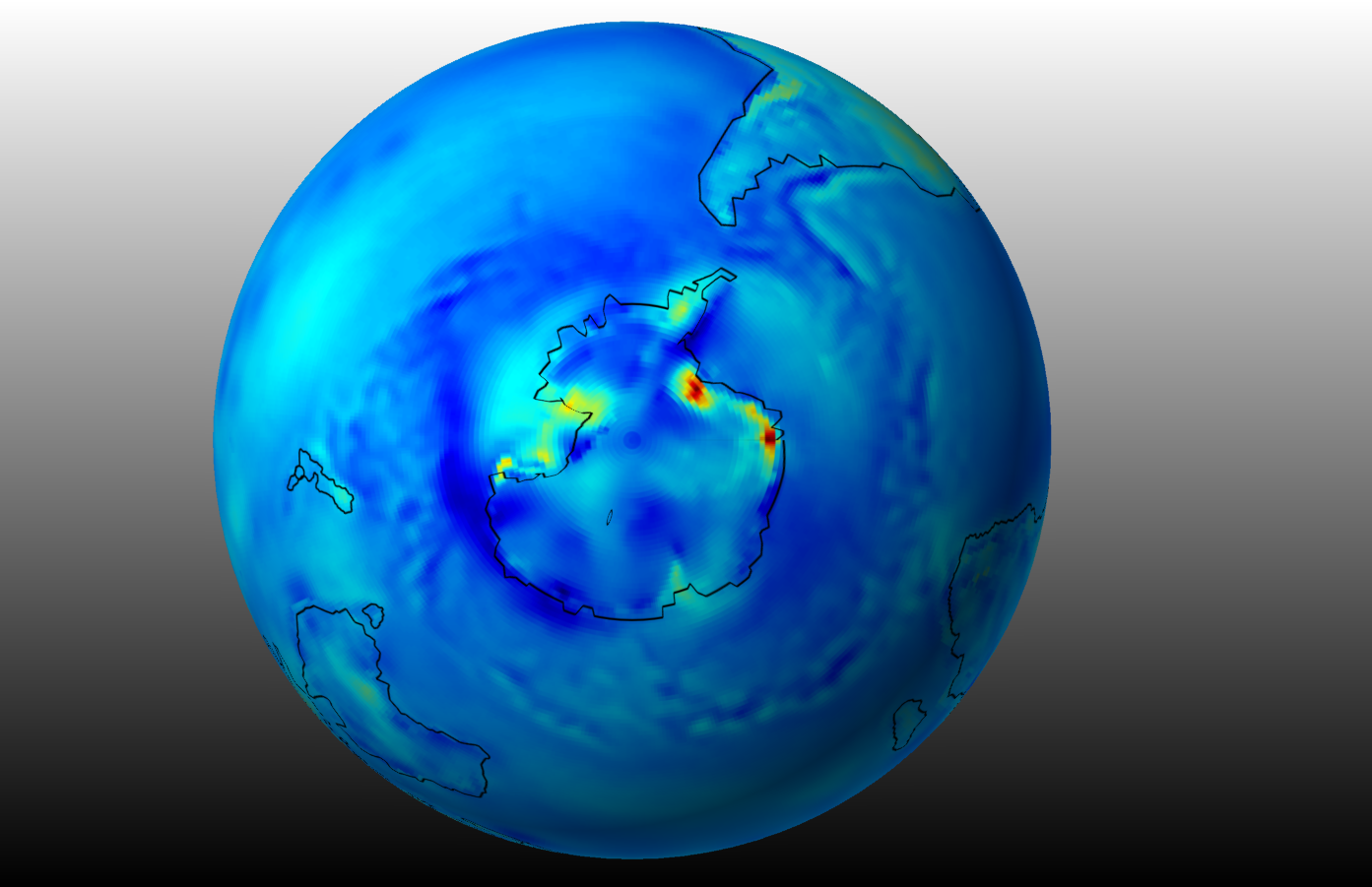
I’m providing a very rough example of how data might begin to be checked. For my informal demonstration audit, I’m starting from this summary map I made (which itself will hopefully be checked by many) of Antarctica’s satellite-weighted surface temperature trends
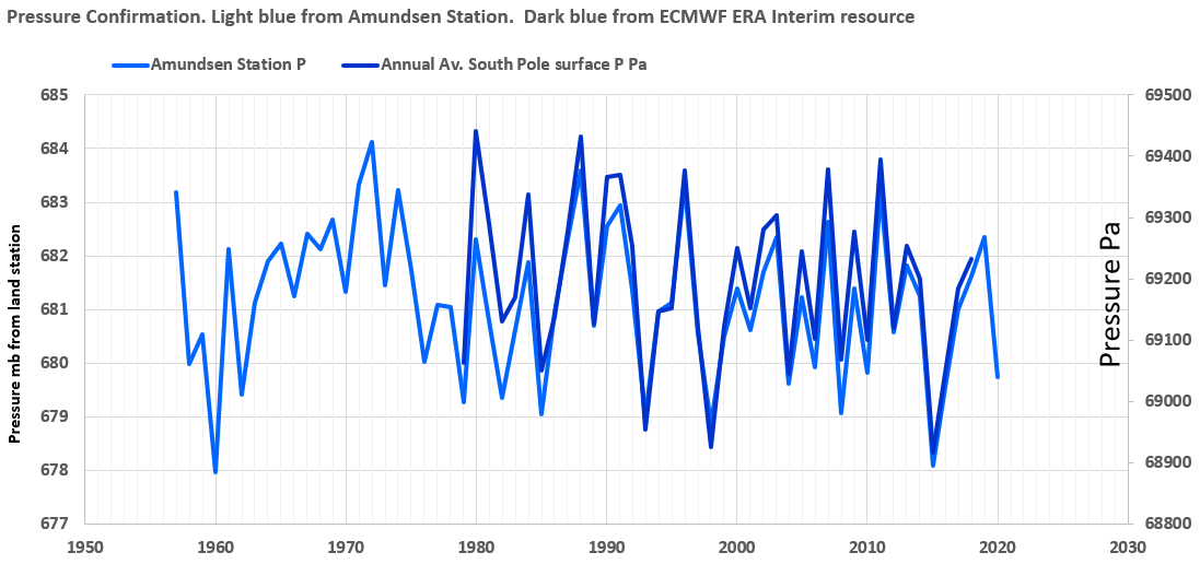
Next, I’ve downloaded some Amundsen Station, Antarctica temperature and pressure data from readings just above the surface. Nominally, because of the ideal gas law and the hypsometric equation, one would expect that as pressure rose, so would temperature and vice versa. Yet this land station data does not consistently follow that pattern, and the final years post a rising temperature, even as the pressure drops.

Again, I can’t find any confirming observations that surface P goes down while surface T goes up in that region. However I was able to corroborate the above pressure pattern in the image below. The satellite pressure series aligns closely to the land based series, with an impressive correlation of .95.
If the pressures are consistent, wouldn’t one expect the temperatures to be consistent as well? At least the satellite temperatures closely align with the satellite pressures. Here below is the satellite temperature in brighter red overlain above the satellite surface pressures. Unlike with the land station values, both parameters now trend down.
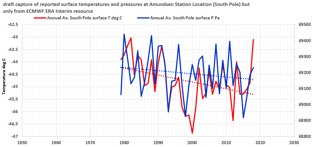
Someone should write a paper about these strange patterns which are limited to the land-based instruments, and perhaps they can explain also why the land surface station temperature measurements are still used by so many climate change modelers, when the values cannot be corroborated by satellite products. It is possible that P and T slopes can cross, especially when moisture events overlap (more moisture equals lower pressure). I have examined a remarkable example of that in a more tropical latitude. But the atmosphere across the interior of Antarctica (where this site lies) is typically very dry, so that isn’t expected. Finally, it appears that the satellite temperatures are quite a bit warmer overall to begin with than the station temperatures. Perhaps the Amundsen station observers will take a long overdue transparent and traceable look into all of these discrepancies.
When Oceans Ice Up, Cooling is the Only Possible Reason
Because oceans have more dissolved ions than fresh waters, their freezing point at the surface is lower than the freezing point of fresh water. And the source of water is always there. On the other hand, glaciers and ice sheets may be cold (simply because of high latitudes and high altitudes), but they are composed of fresh water, from only an atmospheric source. The ice can only be maintained if the supply of fresh water is maintained. Otherwise, even under cold temperatures, the ice can sublimate away to nothing in a very short time.
Again, these patterns help to demonstrate that it is the moisture supply via precipitation that drives the extent of freshwater land ice. Saline ocean ice is another story. There is never a shortage of moisture, and for that matter, there is the incredible heat capacity of the oceans. After all, many climate change-ologists cite this very notion of the oceans’ heat capacity to rationalize to themselves and to you, why the planet hasn’t been warming as fast as they would like. They routinely argue that the missing heat has been literally absorbed by the oceans.
With all of that ocean-absorbed greenhouse gas heat keeping global warming at bay, one wouldn’t expect any icing up in the high seas. But again, given references [3] and [4] below, along with the blue Southern Hemisphere figure above, it is clear that the atmosphere is cooling there and the oceans are freezing more now than 40 years ago. The ice didn’t fall from the sky. It formed in-situ, due to the cooling temperature of the air.
I’m guessing there will be no need for any to push the pendulum back to a cooling Earth crisis mode. Remember that the Arctic in the Northern Hemisphere is warming. And the rest of the planet enjoys a relatively bucolic climate in which temperatures have not trended up or down for generations. These interesting patterns are supported by the satellite data at least.
REFERENCES
[1] DeConto, R.M., Pollard, D., Alley, R.B, et al. 2021 The Paris Climate Agreement and future sea-level rise from Antarctica Nature 593, 83-89
[2] Steig, E.J., Schneider, D.P., Rutherford, S.D., Mann, M.e., Comiso, J.C., and Shindell, D.T. 2009 Warming of the Antarctic ice-sheet surface since the 1957 International Geophysical Year Nature 457, 459-462
[3] Singh, H.A., Polvani, L.M., and Rasch, P.J. 2019 Antarctic Sea Ice Expansion, Driven by Internal Variability, in the Presence of Increasing Atmospheric CO2 Geophysical Research Letters 46, 14, 752-771
[4] Yu et al. 2017. Possible connections of the opposite trends in Arctic and Antarctic sea-ice cover Nature Scientific Reports | 7:45804 | DOI: 10.1038/srep45804
[5] I’ve removed this reference because I appreciate the help of those authors towards work in progress, and I’ll cite when/if a paper can be published.
[6] BlackRock tightens standards for firms on climate change by Dawn Lim and Julie Steinberg, Wall Street Journal, 15 January, 2020
[7] I developed this from the ECMWF.