All working earth scientists seem to believe in anthropogenic Climate Change But where is the globe specifically warming, and where if anywhere is it cooling? And how much for both cases? You may think these are trivial to determine on the internet. This post will still be here when you’re done with your search. One seemingly useful search that is unmuddied by NGOs, is to independently examine the data, especially the overwhelmingly detailed, continuous, thoroughly checked long-term satellite reanalyses data such as ECMWF ERA-Interim (ERAI) resource that I often feature here.
That may be the only way you will find unambiguous, whole Earth mapping of trends in temperature, moisture, winds, and more. Or maybe just go back to what you were doing, because it is hard to look, none will fund the effort, and it won’t earn you a Pulitzer. The satellite-based temperature trend data doesn’t seem to support anyone’s preconceived biases. Not mine, not any skeptic’s, and definitely not the minds of most scientists. But it is as close to factual as we can hope to achieve, and it has much to say about warming and cooling across the globe.
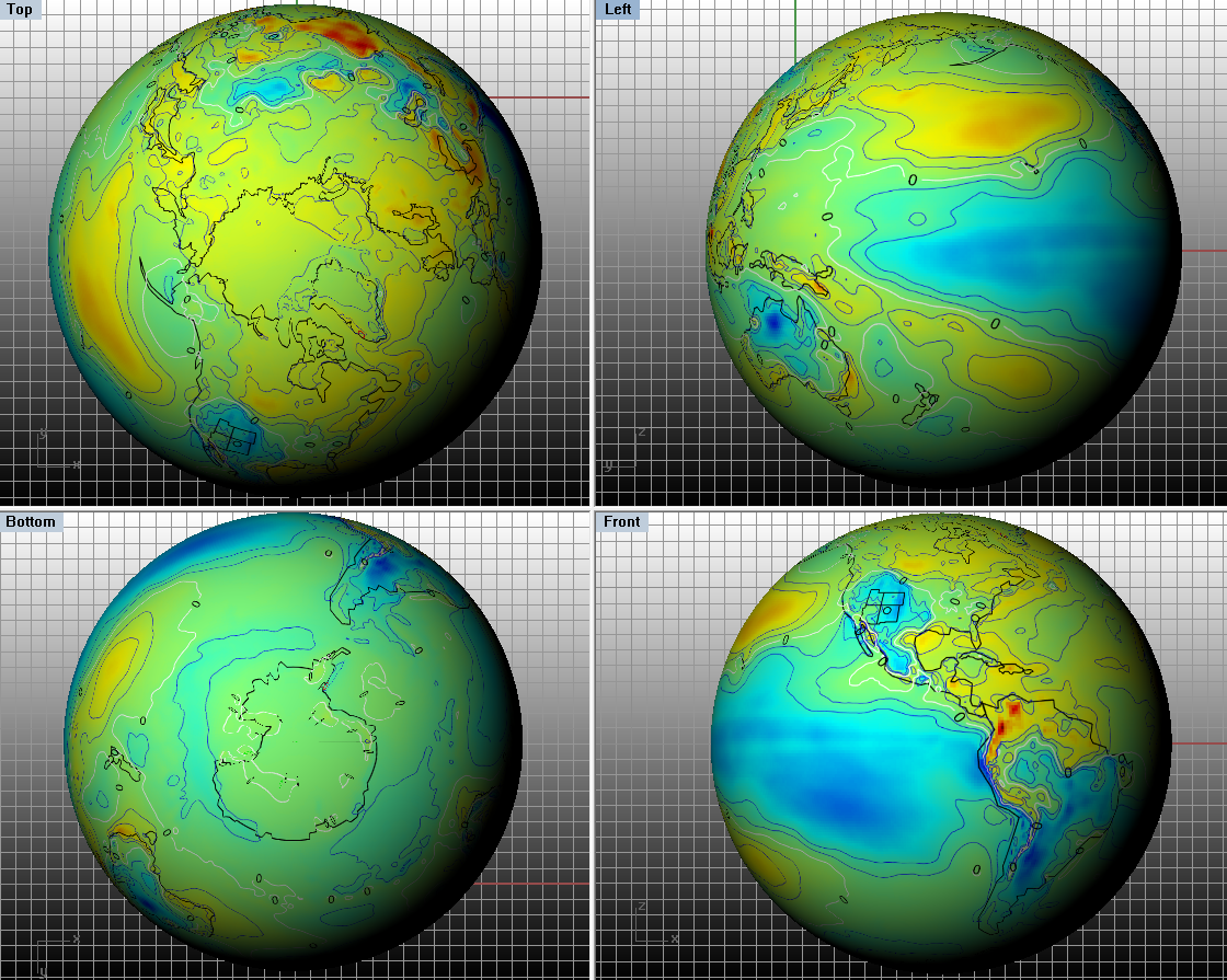
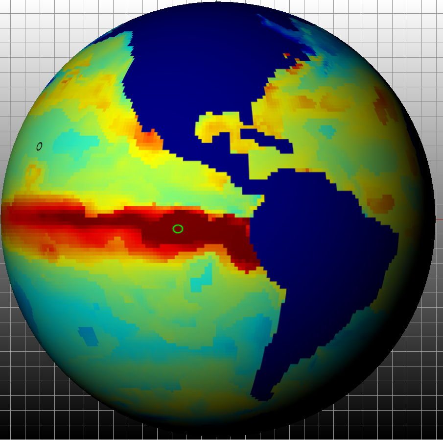
For example, coastal upwelling processes can be invoked to explain some long-term cooling trends sharply defined at major coastal bands. No feedback notions are required to explain that cooling, which is notable for example along the Peruvian (Humboldt) and California upwelling zones. There are great preceding papers which summarize. The featured image and the images which follow are developed from the ECMWF ERA-Interim satellite reanalyses data sets. In draft mode, I”ve extracted all of the months from January 1979 through December 2014 and worked up the linear trend for temperature across the planet’s surface (at 2m elevation actually). Then to augment some of the rendering, I’ve wrapped that map around a spherical surface. The line(s) of zero trend are plotted in white. A few symmetric contours neg and pos surround the white zero – trend line.
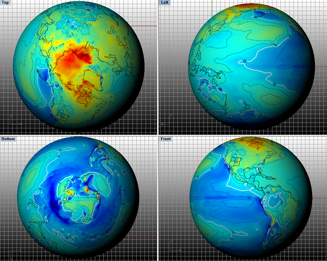
Graphically, trend maps seem to help point out the major physiographic discriminators of global temperature shifts over decades. Earlier posts explore numerical experiments here and by others of a candidate alternate upwelling forcing model at a global rather than regional or hemispherical scale. Yet the lower right hand panel of the above image appears to literally illuminate these cooling plumes from ocean upwelling. Certainly there is warming over the Arctic as well. I follow both trends and the potential causations with others. And I find it helpful to explore many different ways of slicing and dicing time series. The above series is interesting, but does not capture the full available ERAI record, which extends to a bit beyond the end of 2018. I’ll add a few images of those full trends at the end of this post. I’m keeping the time series here limited to the end of 2014 so that I may compare to the following.
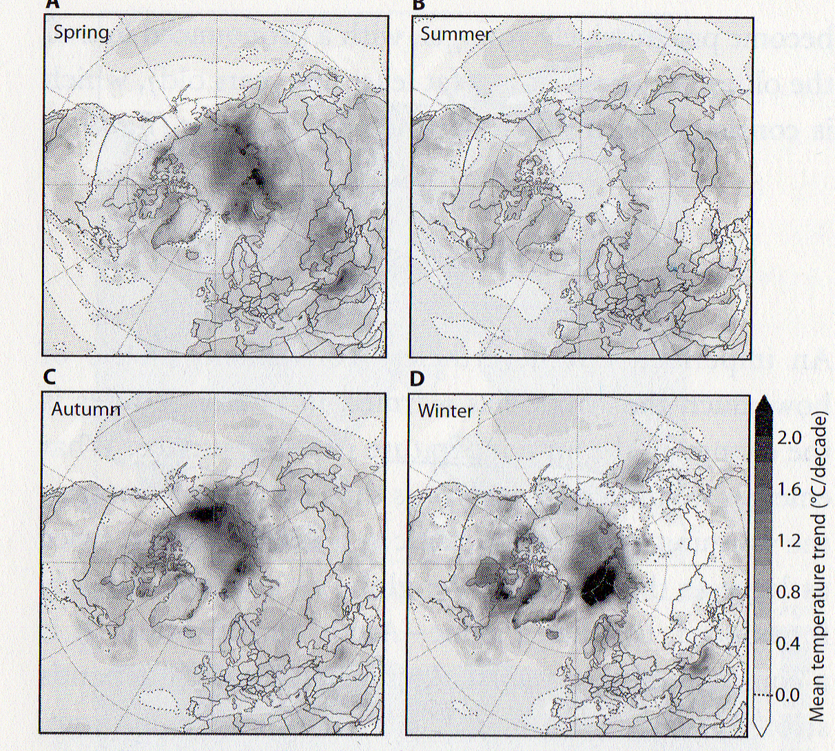
I did find a related limited exercise, which derived data from a similar resource to the one I use for the same time span, but with some different results. Or maybe the results would be similar if all of the richness of the cooling locations were included.
No licenses are provided to any publicly funded scientists or privately funded journalists to leave important contradicting information out of controversial figures, at least without some context. Yet omission of the satellite data, along with most of the cooling parts recently merited a Pulitzer Prize ( Mooney and Wilson of the Washington Post).
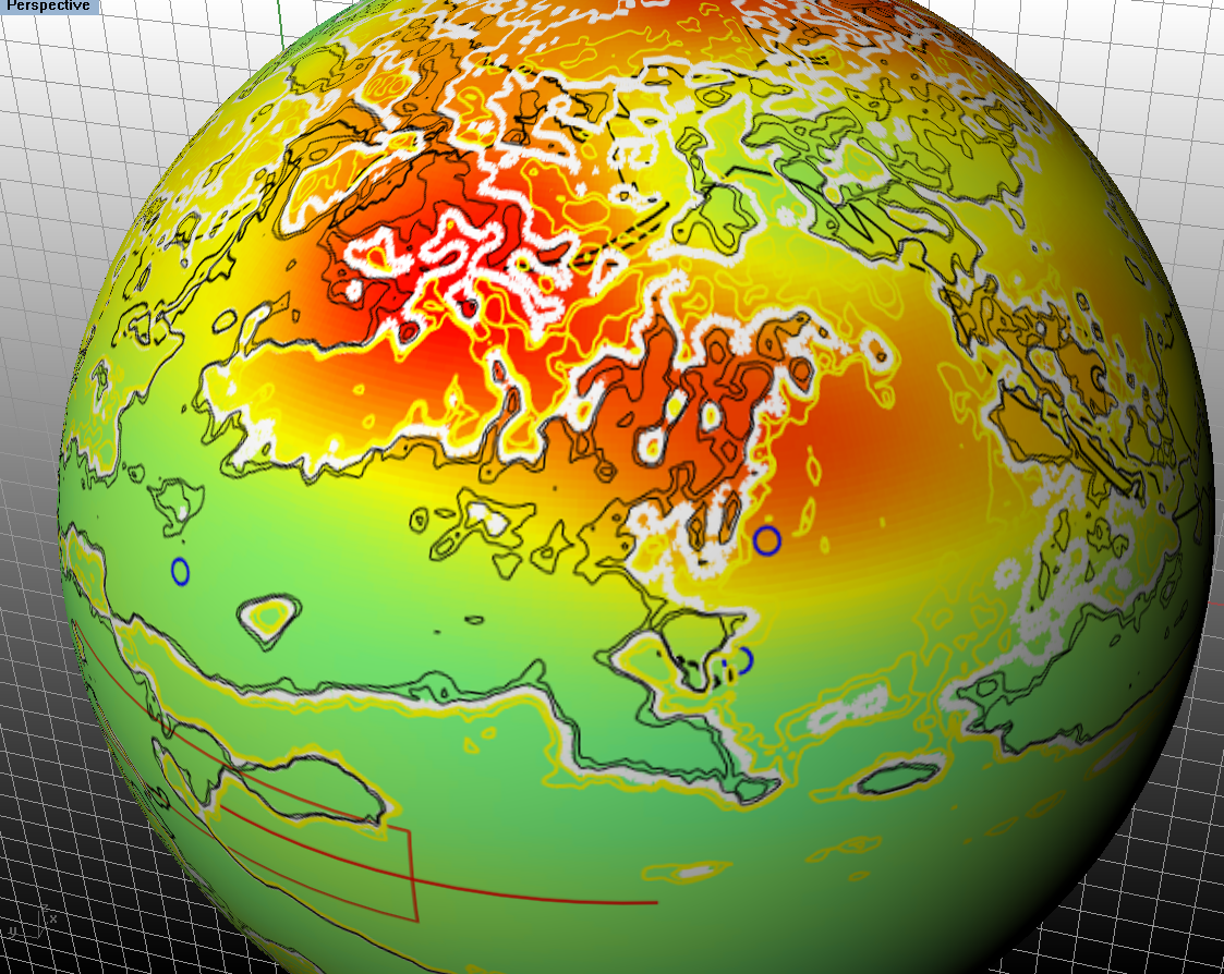
Here’s another nominal description of regionalized planetary warming. Strangely, the title of the story claims that “Europe is warming faster than the rest of the world”. Yet the map is only about the Arctic. Moreover, their arctic warming map is not unlike the warming map featured at this post. Given the detail, that information likely came from the same satellite data I used. I guess they omitted the continental parts, including their featured Europe land mass.
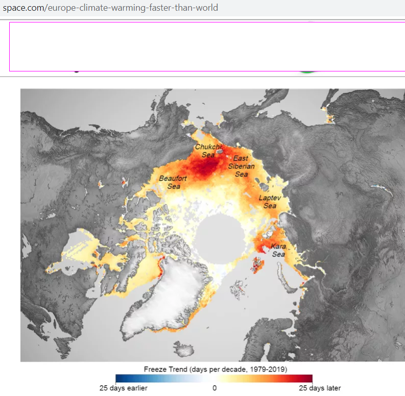
If you want to see what Europe’s warming actually appears like, simply scroll up this post and examine the upper left panel of the second image from the top. You’ll see that Europe’s temperatures have been remarkably stable, given the yellow-green hues. Some continents such as South America and Australia show quite a bit of cooling in comparison at least. That’s also interesting to note that Australia is actually cooling over vast areas. When climate change is invoked, any claim appears to be acceptable.
And Earth’s Drying and Wetting Surfaces
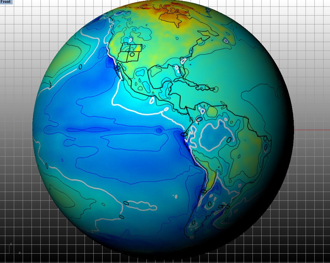
There’s more to all of this surface scratching. Here for example is the same trend treatment for specific humidity at the surface. In this case, I’ve used the full series time span from 1979 through end of 2018.
Blue shades here mean diminishing humidity. Red shades signify increasing humidity. Notably the same chevron pattern is evident across the same Pacific footprint, for the moisture and the temperature maps. Again these combinations appear to suggest that Hadley deposited moist air, condenses over subsidence zones in western Pacific, releasing latent heat, warming the surface slightly more than if no condensation occurred.
There may be other explanations and this is only a speculation feature directed towards better understanding of the ERA-Interim data.
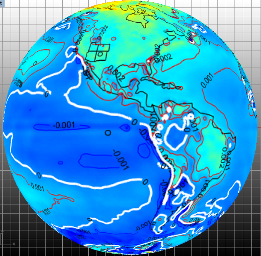
At last I’ve produced some nice overlays of trends in both ERAI surface temperature (t) and surface specific humidity (q). It is noteworthy that q and t trends are so aligned at locations. You can say the same for more which follows. I needn’t go into too much further detail as I prepare for a related poster presentation. As usual thanks to all collaborators and mentors for helping me to reach these connections (whether they agree or not)!
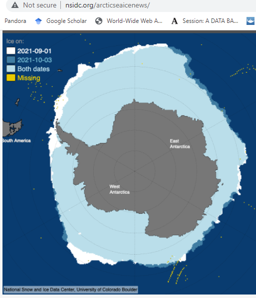
Although it bears a strange resemblance to a mega giant upside-down, partially decayed blue sea turtle strangled by Drake’s Passage, this union appears to be corroborated by alignments to the outlines of Antarctic ocean ice. The same outline is seen surrounding the Antarctic Peninsula at upper left wedge of the Antarctic pie.
I want to thank all who tolerate any interaction. This satellite based information is consistent with both my notions of global full thickness well mixed atmosphere and the surface trends. I try to feature both.
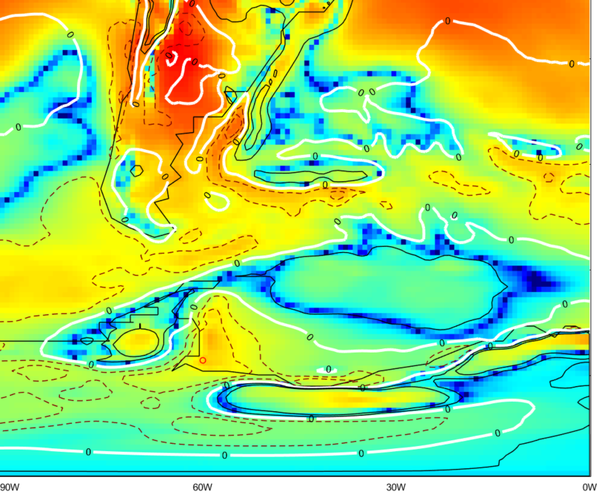
Finally this excerpt expands upon a previous post and complements the relatively humidity / precipitable water frameworks above. Below, the color field defines geostrophic temperature trend in K kg/m^2/month; red is warming and blue is cooling. Please note that in comparison to the other images, the temperatures and other parameters are averaged over the bulk of the atmsophere’s full thickness. That’s why the north Pacific heat plume seen below is not as strongly evident in the planetary surface images at the top of this post.
In this example below, the overlapping contours are of divergence of latent heat (from condensation and evaporation patterns) trend in W/m^2/month, where the zero trend contours are highlighted in white.
Consider that all of the temperature trending information in the image above comes from satellite data. The divergence of latent heat only comes from condensation of moisture, and the geostrophic warming appears to concentrate across that divergence. CO2 and methane don’t condense on our planet’s surface and accordingly, they cannot account for this latent heat anywhere.
Subsidence of circulating air is also a cause of warming, just as uplift of air can cool. But when water is included, the latent heat parts cannot be disregarded. And in this example, the major limb of Hadley subsidence is to the south and west of the red plume.
Or perhaps there are different warming areas that the satellite data didn’t capture? Until those are communicated, I recommend that we pay much more attention to the satellite temperature trend information.
In fact, I’ll close by paying even more attention to data but this time, some non-satellite data. Conveniently, the data was bundled in an .nc file much like satellite data I’m accustomed to reading. Thanks for this excellent work Peter Landschutzer. See [1] for the source details of this data. I’ve worked up the trends and more for both a spot close to Mauna Loa, and a spot in the middle of the Peru Upwelling Current, where most of the CO2 in the map appears to concentrate. I follow with a return to an earlier temperature trend map.
You can see that the red CO2 trend increase regions can correlate in places to cooling air. That’s funny, yet it should not be a mystery.
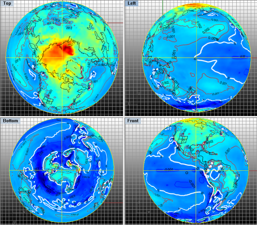
As promised, here are similar representations but for the full time span of the ERAI series. I never can stop tweaking formats of items including contours.
Many more authentic climate mysteries remain. Meanwhile, CO2 climate causation has apparently never yet been successfully vetted against the null hypothesis. There is much scraping against the collective climate data as any might explore. I think this ERAI resource does have much in common with NASA GISS on a minimal point of general temperature trends averaged by latitude. I’ll include graphics in the near future. That’s fine with me and maybe aligns my work better to some. I’m always interested to get on the same geospatial pages. If only NASA GISS could match ERAI across the rest of the modalities and spectrums.
[1]
Source:
MPI-SOM_FFN_SOCCOMv2018.nc
Format:
classic
Global Attributes:
institution = ‘Max Planck Institute for Meteorology, Hamburg, Germany’
institude_id = ‘MPI-M’
model_id = ‘SOM-FFN’
run_id = ‘SOM_FFN_SOCCOMv2018’
contact = ‘Peter Landschutzer (Peter.Landschuetzer@mpimet.mpg.de)’
creation_date = ‘2018-07-12’
Draft, contains opinions, all rights reserved