Satellite monitoring of global seasonal CO2 and natural carbon cycling
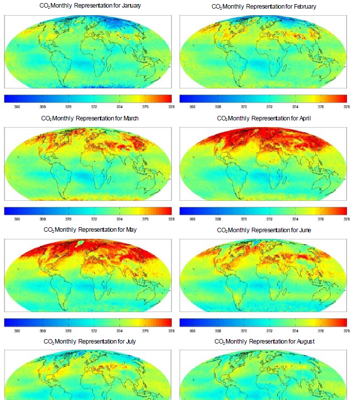
Have there been any peer review publications about the seasonal/monthly, global atmospheric distributions of carbon dioxide as captured by our best satellites, for any data after 2011? The excerpt above from Figure 2 of Pagano et al. 2011 [1], demonstrates some of the monthly satellite observations that did exist before.
The most interesting thing about this featured image set of monthly – scaled mid-tropospheric global patterns is that, as also recognized by the authors, the major CO2 concentrations are seasonal. That might mean a great deal, because we don’t wait for Spring to start driving or to run factories, or to breathe. Does this mean that fossil fuel emissions are not a significant source of atmospheric carbon dioxide? What else could it mean?
The consensus scientists only appear to see seasonality of CO2 through claimed common observations that terrestrial plant growth absorbs enough carbon dioxide every summer (in US for example) to make a visible annually recurring dip in the concentration time series (a Mauna Loa CO2 tilted sawtooth). Yet now with the actual satellite coverage, one can see that the seasonal timing and distribution of atmospheric CO2 around the globe contradicts the narrative. By example, plants are largely dormant here (US) in January or February. Given that they are not removing CO2, the atmospheric concentrations should rise (or at least, not drop) right? And yet the CO2 concentrations are relatively low then. The climate scientists can’t have it both ways.
And this recurring winter CO2 drop in the Northern Hemisphere can be compared to the emergence of the CO2 bloom over March and April, when land plants are photosynthesizing across much of the northern hemisphere. So in this case, because the land plants are removing CO2, the atmospheric concentrations would be expected to drop. Yet they are rising over those months.
There appears to be a much better explanation for these CO2 patterns. As a number of resources indicate (including the global geostrophic wind maps featured in Figures A3 and A4 of a study of seasonal respiratory virus transport that I coauthored), the zonal geostrophic winds are higher in the Northern Hemisphere every April than they are every July . These winds are well known to cause ocean (and lake) upwelling, which introduces significant quantities of the heavier-than-air CO2 gas. Accordingly, the coastal ocean upwelling, driven by Spring winds, appears to account for the bloom of atmospheric CO2 in the northern hemisphere.
Seasonal wind-induced ocean upwelling may account for the bloom of carbon dioxide across the Northern Hemisphere every Spring.
These seasonal maps from [1] are still nominally consistent with Hawaii’s Mauna Loa monitor. Hawaii is the current go-to location for all things about global atmospheric CO2, and so this seemed like a worthwhile exercise. I know others have verified, and I also performed a spot check, and I considered differences in sampling elevation. You can verify that the lower Mauna Loa station appears to report higher concentrations of CO2 than the mid-troposphere layer that AIRS samples. To me this is expected and appreciated. To others, not so much, given that it is widely promoted that CO2 is well-mixed in our atmosphere. In any case, the mild weather of geostrophically – cocooned Hawaii is largely deaf and blind to the real seasonality captured by annual Spring blooms of carbon dioxide to the north. Why do the CO2 experts always point to Mauna Loa CO2 data, while Earth’s major seasonal CO2 changes are completely disregarded? You’d have to ask them.
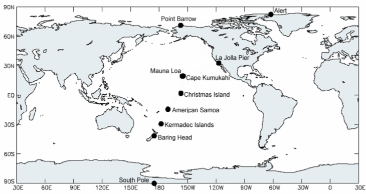
Have any searched the low-hanging fruit of data and information about seasonal CO2 around the globe? Good luck, with the limited and partisan search algorithms currently available. You might see this resource led by climate scientists Drs. Keeling and Whorf, which claims to provide “Atmospheric Carbon Dioxide Concentrations at 10 Locations Spanning Latitudes 82°N to 90°S”. In downloading and examining, you won’t find the promised information. The locations of 10 stations from Antarctic to Artic regions are included, but the concentrations for the ten sites are not. One must go to a linked URL for that complete data, according to their report. Unfortunately, the link is long-dead. They do provide two sites as short charts in the body of their report but those only cover one year, long ago. That’s not what the title of the paper promised. This is also inaccurate work, as indicated by their map of CO2 stations. They don’t even place islands where their stations are supposed to be in the proper locations.
Without satellite coverage, one could apparently never recognize or appreciate the rich and essential seasonal signature. Nor would one be able to compare the alarms by climate change psychologists* to the beautiful and positive reality of our planet’s global seasonal carbon cycling. Yet now the latest monthly/seasonal global satellite carbon dioxide coverages are hard to find. For that matter, the pioneering work of [1] is yet to be showcased in any mainstream climate change journals. To date I’ve only found one relatively contemporary paper [2] that recognizes this now long-orphaned AIRS satellite data. In part, it highlights what is so unique about the AIRS data from the first paper featured in two graphics herein:
The AIRS is the first sensor in the world that retrieves measurements of daily CO2 concentrations under cloud and cloudless conditions around the globe, including terrestrial, oceanic, and polar regions (Cao et al. 2019 [2])
AIRS stands out for monitoring seasonal global atmospheric CO2 in the radiation bands where it counts. Unfortunately, the Cao et al. paper doesn’t appear to share any concerns that the satellite coverage by AIRS is no longer supported and hasn’t been for a very long time. Nor does that paper seem to recognize anything naturally vital (related to life) about CO2 cycling into and out of the atmosphere. No mention for example, of ocean upwelling of dissolved CO2. No mention of photosynthesis either. If I haven’t overlooked relevant keywords, this is amazing really. Even so, the paper is informative and interesting, and it resonates with me at least because they also made an effort to compare to winds.
Now, a decade after [1], the low key retirement of perhaps our most significant satellite CO2 resource ever seems clear. Publications about our satellite monitoring of seasonal/monthly global carbon dioxide have stopped roughly a decade ago. There are raw data in various forms, but the accessible reports appear to only show data from 2003 through 2011.
Seasonal global CO2 maps don’t appear to have been updated in accessible transparent reports for over a decade.
Unfortunately the AIRS satellite program may have finally been frozen by our previous Administration, I would certainly support any initiative to renew funding and even expand AIRS, so long as products are transparent for all to examine anytime.
I’m in the minority as usual, but the observations of [1] appear to reinforce other lines of evidence that natural sinks and sources can account for the bulk of CO2 in our atmosphere. For example, any can share with the original authors in noting the stationary southern equatorial dip in atmospheric CO2 over all of the years and months covered by satellite monitoring. And you can share with me the speculations if you like, that phytoplankton are responsible. And finally, the seasonal CO2 bloom across the northern hemisphere cannot be ignored.
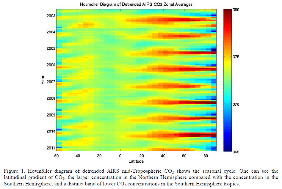
That seasonal CO2 bloom potentially answers many questions that relate to the magnitude of global ocean upwelling, and the seasonal geostrophic wind “bloom” that ushers both in, may be the icing on the cake. After all, upwelling is in great part a coastal phenomenon, and the Northern Hemisphere has the lion’s share of our planet’s coastlines. And of course once the gas upwells, a great portion of it is conveyed zonally around and around the planet many times, so that continental areas also turn “red”.
We may never be able to transparently and efficiently follow up on these possibly critical CO2 questions if the satellite programs are frozen or curtailed. There is somewhat limited OCO satellite derived planetary CO2 data, along with its apparent fusions with other models, from NASA that are current. I’d be interested to examine summary quantitative information. A Hövmeuller Diagram for OSO and/or its blends, like the chart of [1] shown earlier above would be excellent. Currently, no public summaries of this nature appear to be available. My expectations for any new OCO data reports would be conditioned by other monthly environmental data products such as those of the USGS, or climate products like ECMWF or ERA-5 that also quantify some atmospheric gases.
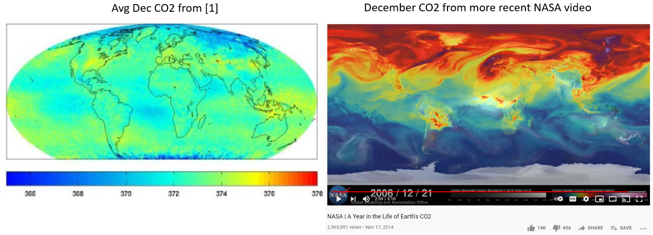
I’ll continue to explore the available representations of natural global seasonal CO2 for consistency. Here’s an example below. On the left is the average December CO2 distribution from the data-centric AIRS satellite program [1]. To its right is a more popular graphic, viewed by millions over nearly a decade which shows a contradictory December CO2 distribution from the OCO program. And it seems many viewers of this video believe it to be real data as well even though careful reading shows it is a simulation. The data on the left indicates low CO2 across the Arctic over December while the OCO graphic on the right [3] indicates high CO2 across the Arctic over December. Both AIRS and OCO cannot be right.
It’s possible that NASA, which runs both the AIRS and OCO satellite programs, has not yet publicly compared results between them. I can at least screen capture a few relevant images from Figure 3 of Reference [4]:
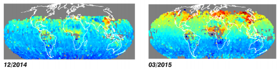
You can compare these to the AIRS data featured in this post. You’ll be able to partially confirm that the CO2 plume emerges and fades over the same months and areas as AIRS shows. OCO cannot however tell us anything about the North in Winter. In other words, OCO has zero Northern winter data, and AIRS has relatively complete Northern winter data. And AIRS documents low CO2 in the North over the Winter. Yet the OCO video above this image shows a significant CO2 plume across the North in Winter. How can these be reconciled?
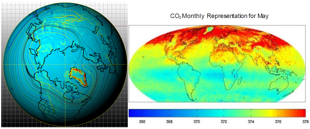
The AIRS satellite data already available can keep one busy for some time. For one thing, the pool of high CO2 surrounding Greenland for May and June is intriguing. It’s an amazing Rosetta Stone I think, which likely will eventually help tightly bind global wind circulation to global atmospheric CO2. So why is Greenland insulated from the CO2 bloom? Is that from atmospheric downwelling? If that’s the case, even more questions emerge. The resource of [1] was a pioneering advance in my view because it seems to offer both answers and to invite further interesting questions.
WHY IS CO2 REALLY RISING?
With the encouragement, support and guidance of some very smart colleagues who don’t claim to have all of the answers, I explore a more natural notion of the cause of CO2 rise. It relates to a previous Dissolved Inorganic Carbon post, and also to Solar cycles. Again I’ll try to contribute with others on peer review.
[1] Pagano, T.S., Olsen, E.T., Chaine, M.T., Ruzmaikin, A., Nguyen, H., and Jiang, X. 2011. Monthly Representations of Mid-Tropospheric Carbon Dioxide from the Atmospheric Infrared Sounder. Proceedings Volume 8158, Imaging Spectrometry XVI; 81580C (2011) https://doi.org/10.1117/12.894960
Event: SPIE Optical Engineering + Applications, 2011, San Diego, California, United States
[2] Cao, L.; Chen, X.; Zhang, C.; Kurban, A.; Qian, J.; Pan, T.; Yin, Z.; Qin, X.; Ochege, F.U.; Maeyer, P.D. The Global Spatiotemporal Distribution of the Mid-Tropospheric CO2 Concentration and Analysis of the Controlling Factors. Remote Sens. 2019, 11, 94. https://doi.org/10.3390/rs11010094
[3] NASA | A Year in the Life of Earth’s CO2 – YouTube
[4] Elderling et al. 2016. The Orbiting Carbon Observatory-2: first 18 months of science data products. Atmos. Meas. Tech., 10, 549–563, 2017 www.atmos-meas-tech.net/10/549/2017/ doi:10.5194/amt-10-549-2017 https://amt.copernicus.org/articles/10/549/2017/amt-10-549-2017.pdf
*You’d have to ask 350.org why they turn to psychologists for climate science direction.
 7350total visits,1visits today