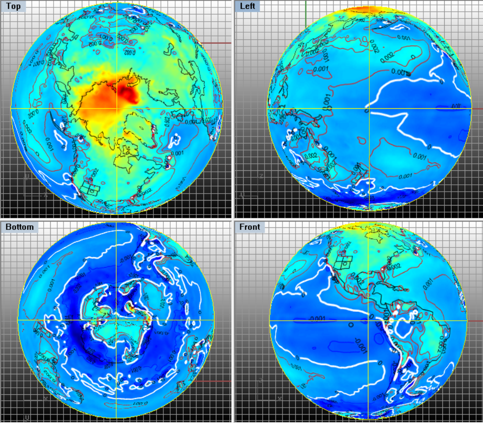
I’ll integrate all temperature content in a submission for peer review. The featured image at top is simply a set of views of the trend of temperature over this time period near the surface. The white contour line is the zero trend. Blue is cooling and reds are warming. Those patterns again corroborate a warming Arctic and a cooling Antarctic. From my perspectives and even past publications (mwa HSJ 2019), solar forcing and hydrospheric circulation can account.
Linear trends seem compelling in my opinion, yet the trends don’t follow narratives by other climate researchers. Meanwhile rom ERA-Interim data, a draft of the same source surface (2m) air flows and temperatures can be roughly examined for any year of that span.
I’ve set the color scale to highlight middle latitudes. Given current media focus, it can be interesting to scroll this video forward or backward to see how regions such as Europe can notably warm and cool, while other regions don’t change much at all over time.
A similar video soon for upper latitudes.
I’m including in a manuscript in progress with others.