CLIMATE GALLERY
Welcome to the CSIM Climate Gallery
These works were developed in alignment with both research and with other content. I link each image and/or animation to one or more posts at this or that site. The images are not arranged in any particular order. Many of the images will animate when selected. Most can be selected for further magnification. Please cite this site also derived from [1] and data from ERAI [2] as well as the US Geological Survey [3] and the University of Washington [4].
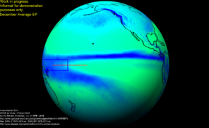
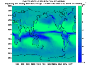
Also featured in a past post, the following animation describes the average moisture conditions by month across the planet, based on 36 years of continuous satellite coverage integrated through the full thickness of the atmosphere. Deep blues indicate greatest intensities of precipitation and brightest greens indicate greatest intensities of evaporation.I’ve complemented that with a few profiles of North America and the East Pacific, including this from a post I labeled the United States of Water.
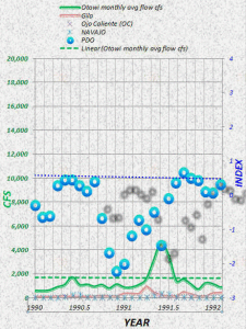
From an early post of this site, the remarkable synchronicity between the Pacific Decadal Oscillation (PDO) [4], and some of the featured USGS streamflow records of the Southern Rocky Mountains [3], are illustrated through a shadow-embellished animation. For more information please visit [1] and or mini posts such as PDO and NM River patterns.
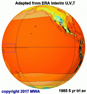
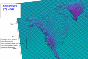
This animation below demonstrates that over a 60 month average, the full atmospheric thickness monthly air temperature hardly changes, except sometimes precisely over my chosen primary study area.
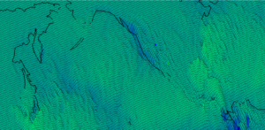
The motions are subtle in this animation of the ERAI temperature-for-the-full-amospheric-thickness data across North America.
The same lackluster Temperature dynamic plays out across the western equatorial Pacific and neighbors.
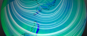
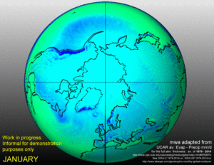
This animation below is not directly associated with any post but it complements many of those. It captures the ERAI EP (Evaporation minus Precipitation) data from each average month (based on the years 1979 through 2014). The white streamlines typically terminate at the Greenwich meridian. The greener the color, the greater the evaporation and the bluer the color, the greater the precipitation.
I think this above animation is particularly complementary to a recent post on the Arctic Ice Cap.
The following series are adapted from recent posts about the Ozone Hole
the host post compared these patterns to the ozone hole theory.
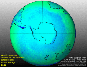
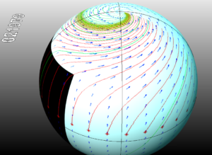
 South Polar circulation March. select to enlarge
The single-layer hydrosphere, premiering at [1] may begin to capture the seasonal changes in hydro-vorticity at synoptic scales across many areas. Maybe this is especially true around the South Pole and its geostrophic suburbs.
 As water would splash across a pivoting bumpy surface, our hydrogeostrophic atmosphere literally cascades across the Earth’s hemispheres across every season.
 Perhaps Boltzmann Transport Equations (BTEs) can simulate global hydrospheric transports better than any existing climate model strategy.
Nano-mineral hydroxides and their planetary cousins
A Southern Annular Ocean dynamo-ozone ring notion
Hemispheric annual moisture vortexes
Geostrophic moisture drives glaciation patterns
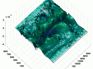
This animation is adapted from Wallace, 2019. As it cycles between January and July, it captures the planet’s global hydroclimatologic biannual oscillation in a way that is particularly concrete. The deeper the elevation of the surface, the greater the amount of precipitation based on the full atmospheric ERAI reanalyses resources.. so from actual data.
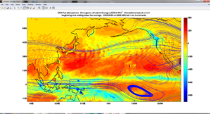
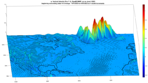
The images below are follow ups on the Hawaii stationary “wet spot” which I’ve covered at times. For below I’ve examined surface orographic (vertical component) of winds through color and “elevation”. They correspond to that moisture spot because the winds are consistently directed downward at the same location as the augmented moisture. The radially symmetric ripples around this spot are clear, perhaps for the first time. Think of a pebble dropped into a pond, and the physical analogy is actually very close. The second image is just an example from panning the same map further east, where the vertical winds over Greenland stand out, much as this vertical wind post shows.
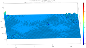
Stationary radially symmetric vertical wind ripples surround Hawaii across thousands of kilometers. Please cite Wallace and/or Abeqas.com for this possibly original observation.
Background:
The inspiration for most images comes from the expanding empirical relations which are rooted in studies of hydrodynamics and solar forcing, particularly the planetary-scaled geostrophic circulation of water and air. From past work I’ve advanced (Wallace, 2019), this approach offers and/or supports alternative solar-cycle based interpretations for contemporary satellite-era global weather and climate observations:
- sea levels
- rivers,
- lakes,
- winds
- polar ice caps,
- polar vortexes
- the jet streams
- lightning patterns
- glaciers,
- hurricanes,
- tornadoes,
- monsoons
- the tropopause
- latent heat domains,
- OLR domains,
- stable isotopes of hydrogen and oxygen in the atmosphere
- ozone patterns
- ocean oscillation patterns (PDO, AMO, SOI)
- ocean pH (so-called ocean acidification) patterns.
- ocean thermoclines
- The intertropical convergence zone (ITCZ)
References:
[1] Wallace, Michael G. 2019. Application of lagged correlations between solar cycles and hydrosphere components towards sub-decadal forecasts of streamflows in the Western US. Hydrological Sciences Journal, Oxford UK Volume 64 Issue 2. doi: 10.1080/02626667.2019.
[2] ERAI resources at UCAR for the monthly integrated full atmosphere thickness of Evaporation minus Precipitation, Temperature, Divergence of latent energy, zonal and meridional winds, and Geopotential Height. 36 years to the end of 2014.
[3] https://waterdata.usgs.gov/
[4] http://research.jisao.washington.edu/pdo/
 19659total visits,2visits today

