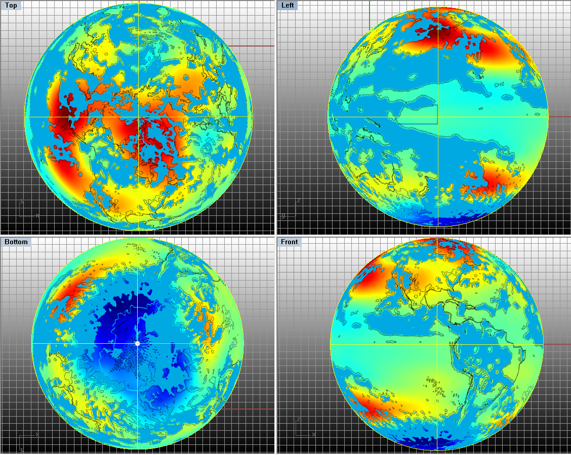
The color field captures ERA-I trends of Temperature over several decades. Red hues indicate the greatest temperature increases from 1979 through 2014. The blue-gray patches indicate where synoptic scaled precipitation has increased over the same time period. That part is somewhat rough, and I’ve not yet filled in all of the blue outlines. And it is only a mask. More will be found in subsequent formal products. Underlying these graphics are my runs through a draft code which aspires to support as a Lagrangian Engine. The temperature map is also featured in the previous post.
I think the added interpretation is clear, and any can refer to a publication I authored [1] a few years ago, to learn more about the latent heat that influences our global energy balance. Even many hydrologists seem daunted about quantifying the latent heat that is produced whenever water vapor condenses. Nor do any earth scientists appear to recognize the massive dominance of this heat in our global atmospheric energy balance. But facts are stubborn, and I would like to pay more attention to them. Accordingly, could the global venting of latent heat explain Arctic warming? And could a continental barrier to such venting, in a broader perspective of the down-trending cyclic rhythm of solar forcing, help to explain Antarctic cooling? I hope any who follow up to investigate will not neglect to cite this post. I plan to when I submit a manuscript.
In advancing where time permits, I’ve tried a complementary way to characterize this relationship between trends in the divergence of latent heat (LEDIV) and trends in geostrophic and surface temperature. In the next image, I’ve set LEDIV trend as the color field. The two contour lines show some coverage of areas of the Earth that are warming geostrophically. The thin black line expresses about a 17 K kg/m^2 geostrophic warming trend. The thicker white line shows a trend of 26 (same units).
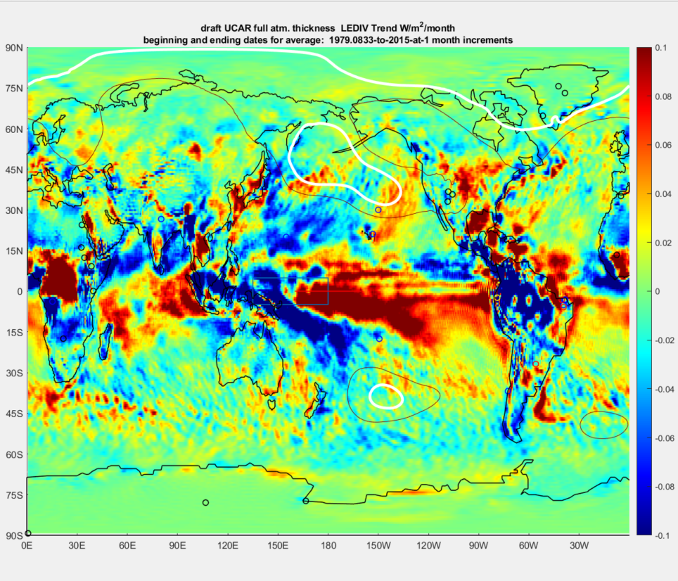
So as to leave less to the imagination, I’m exercising further contouring prerogatives to outline the dark blue areas below as regions of the geostrophic planet which are cooling or at least not really warming significantly.
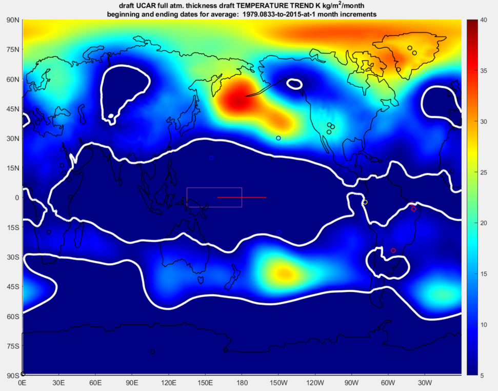
One might conclude that the heat trending across our geostrophic atmosphere has much to do with Hadley moisture dynamics. That again has much to do with solar forcing [1]. I’m fairly certain at this point that it has little to do with CO2 dynamics. And that’s why papers are needed beyond this sole blog. Still, I plan to add an interesting surface variation of these coverages. Naturally temperature trend signatures across the Earth’s surface are more subtle and magnificent at the same time.
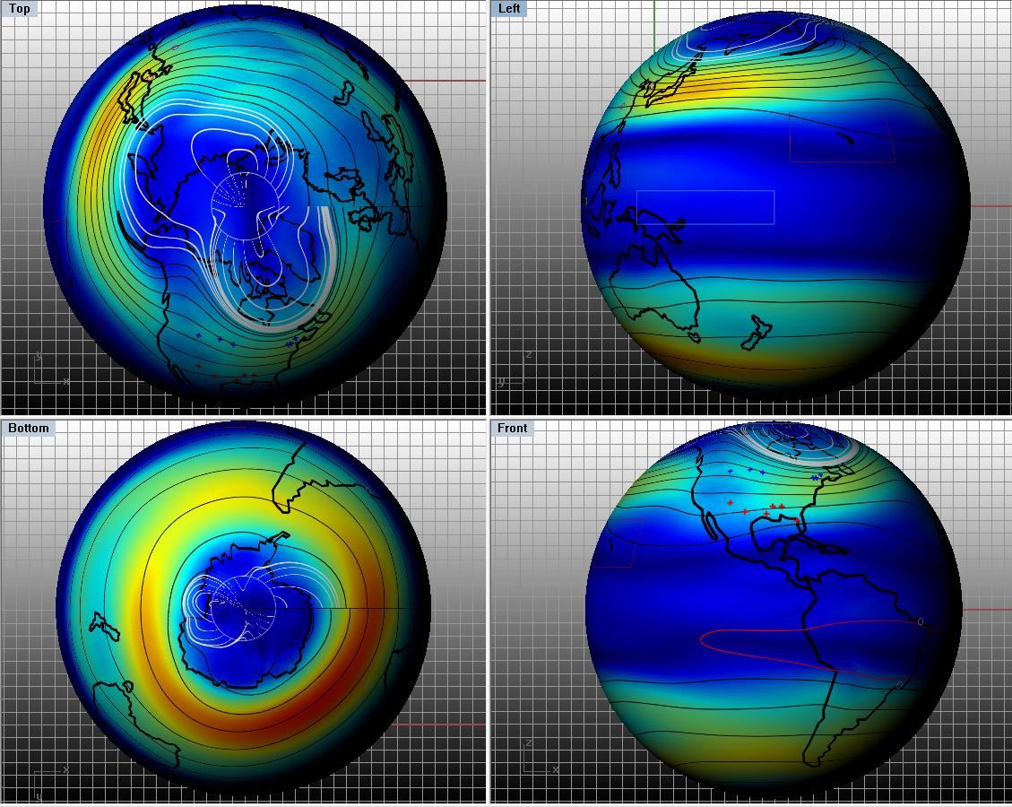
I may add various to this post as nominally related. Here’s an example where I’ve been wrapping maps from earlier work around spheres. I’m leaving out most annotation other than to note that over this yet to be designated time frame, the deeper the red, the stronger the magnitude of geostrophic wind. And the deeper the blue, the weaker that magnitude.
Related Feature: Albedo and the Sun
In the two frames below, I have paired a recent record of diminishing solar radiation (via sunspot number) to a corresponding record of diminishing planetary albedo based on CERES satellite data and informed interpretations of global, surface, atmospheric and hemispheric albedo patterns [3].
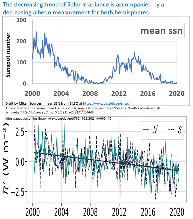
This appears to support the notion of Solar Forcing of Earth’s climate that was explored in [1] as well. Many might at least accept that as solar cycles have trended down, so has albedo. And it would certainly make physical sense. Less Solar radiation leads to less convection of moisture, which leads to less cloud formation, which leads to less albedo, among other interesting topics that relate.
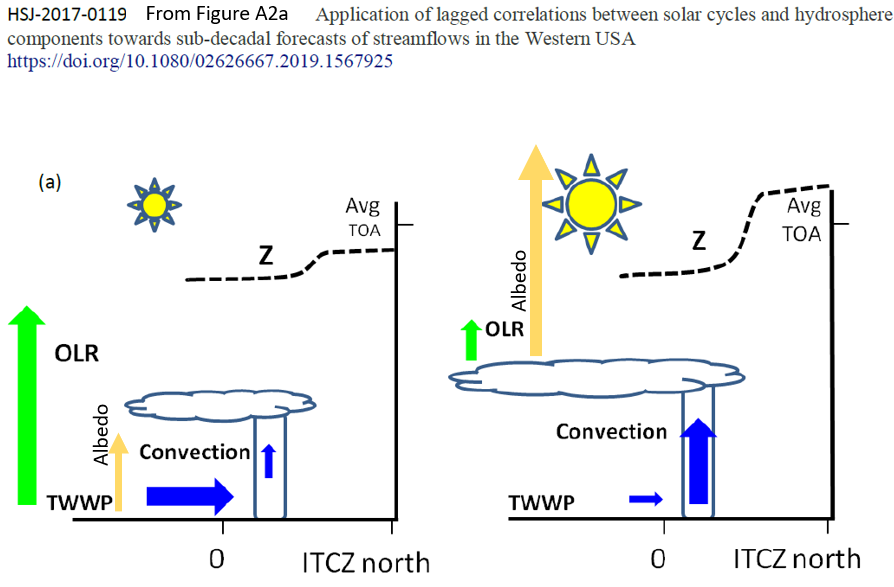
Figure A2a of [1] is handy to annotate over in helping to illustrate these basic concepts. I’ve simply added the albedo changes. The diagram already illustrates related changes in Outgoing Longwave Radiation (OLR), geopotential height (Z), Horizontal component of trade winds of the western equatorial Pacific (TWWP) and convection across the same footprint, all as they are influenced by relatively lower solar radiation (left) and higher solar radiation (right).
I continue to read albedo publications, but I only find the usual wistful thinking about albedo’s potential effect on climate change. Much attention is routinely given to potential feedbacks, with a popular one claiming that as greenhouse gases warm the Arctic ocean, the loss of protective ice happens to also lower the albedo, thereby heating the planet even more [4]. It seems challenging to me to reach such planetary scaled conclusions, because the work appears to disregard the cooling across Antarctica. That paper also relies on CERES satellite data to capture albedo data, as do I. But the same paper omits any satellite data, including my favorite, the ERAI resource, for temperature. Rather, they cite the NASA GISS compilation. The two temperature resources cannot both be right.
Another common albedo narrative is to share some of the notions in [1], that if the planet warms, then more moisture must evaporate from the oceans, leading to more clouds. Yet that once more means that an increasing albedo should be expected from a warming planet. Again, this post has cited an independent chart above [3] which details that global albedo isn’t growing, but rather is decreasing.
At least [1] is consistent with all of the relevant observations. Given that the prevailing anthropogenic warming claim cannot seem to reconcile with the contradictory observation of diminished albedo, wouldn’t any earth scientist take a moment to reflect?
Apparently not. Instead, the scientists will cite feedbacks and will continue to not cite [1]. Feedbacks are widely embraced by many in the hydro field to suggest why they cannot explain something. Yet, as Stephens et al. [5] notes, “Our inability to quantify these feedbacks with any certainty is recognized as one of the major obstacles in climate change prediction”
Update 17 April. I learned of this article through a twitter feed. It appears if anything to corroborate much of the above. https://www.washingtonpost.com/weather/2022/03/18/antarctica-heat-wave-climate-change/
And I’ll continue to explore this direction of publications relating to the intersection between latent heat production, transport and venting.
References:
[2] SILSO sunspot numbers SILSO | World Data Center for the production, preservation and dissemination of the international sunspot number (sidc.be)
[3] Datseris, George, and Bjorn Stevens. “Earth’s albedo and its symmetry.” AGU Advances 2, no. 3 (2021): e2021AV000440.
[4] Pistone, Kristina, Ian Eisenman, and Veerabhadran Ramanathan. “Observational determination of albedo decrease caused by vanishing Arctic sea ice.” Proceedings of the National Academy of Sciences 111, no. 9 (2014): 3322-3326.
[5] Stephens, Graeme L., Denis O’Brien, Peter J. Webster, Peter Pilewski, Seiji Kato, and Jui‐lin Li. “The albedo of Earth.” Reviews of geophysics 53, no. 1 (2015): 141-163.
[6] Wallace, Michael G., and Yifeng Wang. “Pollen antigens and atmospheric circulation driven seasonal respiratory viral outbreak and its implication to the Covid-19 pandemic.” Scientific reports 11, no. 1 (2021): 1-11.
Draft and may contain opinions. All rights reserved.
*the L engine now has a GitHub page.