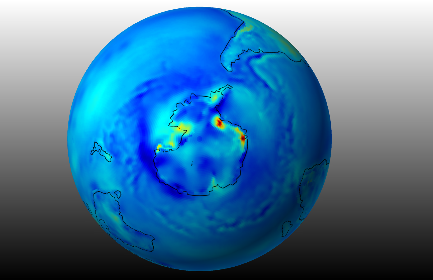
Antarctica and most of the Southern Hemisphere has apparently been cooling for decades. The ECMWF satellite-informed meteorological surface temperature data, tracked across the full Southern Hemisphere over 40 unbroken years, are clear. The darker the shades of blue in the featured draft image, the more those regions have cooled.
That’s so unexpected that I have worked to confirm through independent outreaches to subject matter experts. I thank them for helping me to corroborate to date.
It’s also unexpected by any, I think, that the surface air temperature trend aligns so clearly with the ocean bathymetry. It is not a secret that along with winds, Ekman, and Coriolis features, the topography of the ocean plays a role in currents. Nor is it a secret that ocean currents are associated with surface air temperatures. But I haven’t found a paper yet which equates the ocean topography with surface air temperature trends.
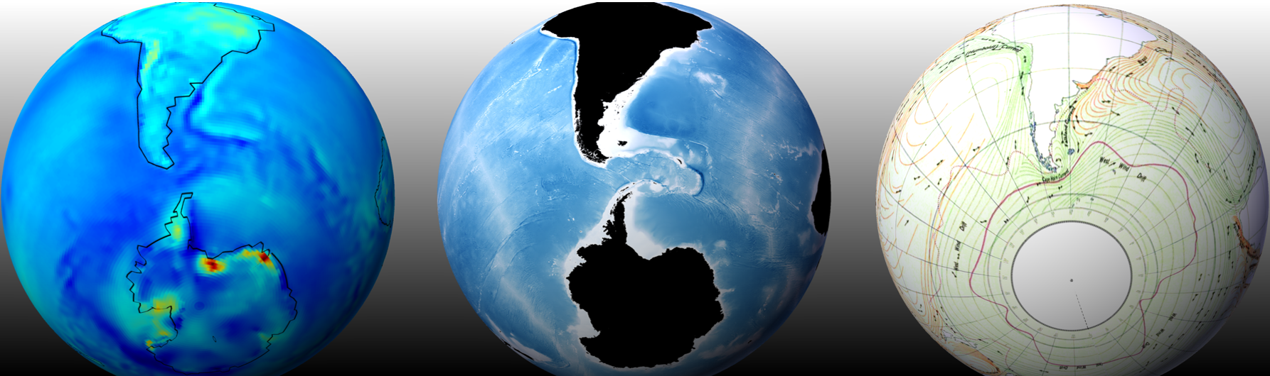
The figure below compares this ECMWF-based temperature trend (left panel) to a NASA ocean bathymetry map (center panel) to an ocean current map (US Navy 1943). In the Navy map, the green streamlines represent cold currents and the orange streamlines represent warm currents. I’ve oriented the views to emphasize the interesting Falklands Plateau and Drake Passage regions that lie between South America and Antarctica.
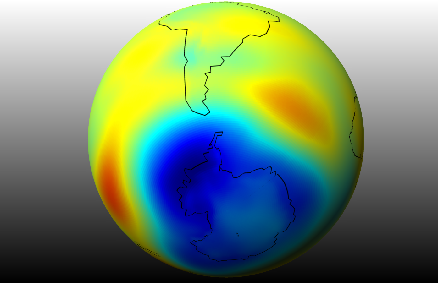
Regular visitors know that I am a fan of viewing the globe through a geostrophic lens. Accordingly, here is the geostrophic version of temperature trend over the past 40 years. This is therefore the trend in average temperature of the full atmospheric thickness (well, close to full thickness, because the ECMWF lopped off several thousand kilometers of upper altitude from their earlier reanalyses).
The best data fusions available appear to indicate that the Antarctic regions are cooling, This isn’t my opinion. Simply apply your favorite variety of the null hypothesis and you might come to agree that this data is a simple repudiation of what the most widely distributed and cited papers claim.
Accordingly some of the novel observations and notions, right or wrong, described in this post are:
- The global surface air temperature trend map expresses a strong correlation to ocean bathymetry and apparently therefore to ocean upwelling.
- Although global surface air temperature maps always show a strong correlation to surface topography, this correlation disappears when the associated trend maps are examined, and see above.
- The surface of the Southern Hemisphere has a cooling trend over land and ocean.
- Antarctica has expressed a significant cooling trend over the past 40 years, both at the surface and for the full thickness of the air column.
Right or wrong, please attribute if you use or discuss.
BONUS material:
I have gone an additional step and spot checked a few values from this geostrophic perspective (and am saving to share a file ‘AntTempsSlopeDown.png’ with any who request). I’ve even received informal confirmation of my trend interpretation from an Arctic scientist. Another who has published a fairly charged paper on polar warming does not dispute that the continent is cooling. I hope those researchers will come around to sharing these developments with others as they have with me.
In any case, the interesting surface temperature trend via bathymetric signature appears to me to to be the bottom fraction of the Antarctic variation of Greenland’s hydrospheric manifolds. The images at that post and those here might also support an orphaned notion that upwelling of cold ocean waters are accompanied by cooler air temperatures and a great deal of outgassing of carbon dioxide. That’s also funny because it associates CO2 with colder air temperatures in localized regions. If you really believe that CO2 is the horse and not the cart, then this might pose a further challenge, in addition to the main points here.
But if these wrinkled cooling surface temperature patterns stimulate your interest, then consider the peer-reviewed world to see what the best ocean scientists have to say. If this report on ocean upwelling and climate change is any indication, researchers appear to believe that global warming is causing the upwelling. Rather, they don’t appear to believe that ocean upwelling is highly correlated with long term cooling. Perhaps the figures below help untangle the discrepancies between their interpretations and mine. First, I’ve taken Panel B from Figure 2 of Morrison et al [1] and placed at left, followed by an inverse color copy in the center. Then I’ve added my featured temperature trend image at right.
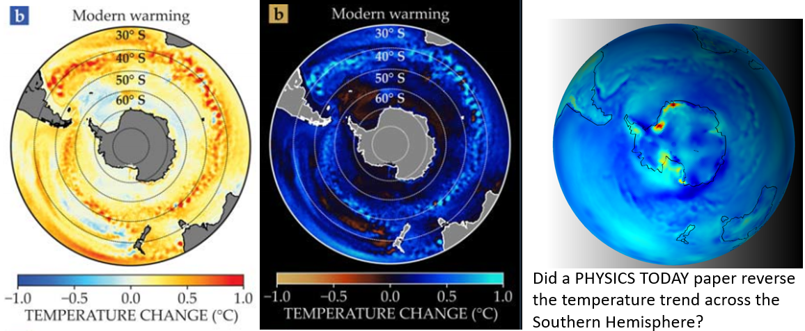
The inverted color version of [1] seems similar to my map. Accordingly I do think that the PHYSICS TODAY Morrison et al. paper may have accidentally reversed the temperature scale for their alarming warming image at left. Or perhaps the cooling regions weren’t captured with sufficient fidelity. The image doesn’t even seem to match their own citation unless something about cooling is corrected. Here’s why. They cited Griffies et al [2], so I took a representative image and compared that again to my map. I wrapped their image around a sphere to facilitate the comparison:
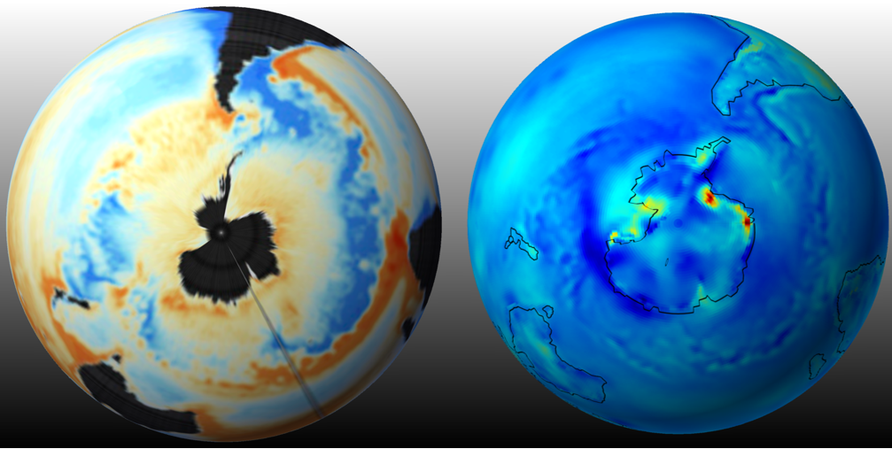
You can see that the uninverted colors of the cited Griffies et al paper aligns in many ways with my data image. By the way, the Griffies et al image claims to be a climate model result, and NOT data. But even that seems odd to me because their model seems to have a very high spatial resolution, which normally is not expressed in any climate scaled model. And as usual, it’s unacceptable to cite a model to support any climate conclusion, anywhere, anytime, by anyone.
Perhaps as with the AMOC, there is more to this upwelling-warming-modelling story also. I’ve reached out to a coauthor of one of these papers to learn what I can. The best option most might agree is for the authors of [1] and [2] to ensure that readers can see the observational data so they can compare immediately to the featured warming upwelling models. Again, it’s unacceptable to broadcast conclusions from any model without comparing to data. The bad form is amplified when the scientists claim certainty about an existential threat, based on a model that is never compared to historical data. Although my featured T trend map is somewhat novel in implication to upwelling, I do offer it as a corroboration test, because it is for all practical purposes, observation data.
Here’s a final reference example that relates. DeConto et al. [3] are a bit more dire in their messaging about “The Paris Climate Agreement and future sea-level rise from Antarctica”. I was interested in the scientific team’s claim that Antarctica’s ice loss is accelerating, and so I checked into DeConto’s key reference by Shepherd et al, “Mass balance of the Antarctic Ice Sheet from 1992 to 2017” [4]. The Shepherd team actually contradict DeConto, by showing that East Antarctica, which is 5 times larger than the rest of the continent, has increasing, or at least largely stable, ice mass. Yes they claim ice has been lost from a small fraction of Antarctica but then they leave one to think that the entire continent is similarly afflicted. It’s extraordinarily odd because they base all of this on perceived changes to the thickness of the ice. In other words, they fail to demonstrate that the Antarctic ice sheet area is shrinking, not even a smidgeon over the past 40 years.
When I read climate change papers, I typically get a sense that these were written with considerable help from attorneys. It is often somewhat hard even for a scientific peer to understand what the climate change-ologists are trying to say and what they are trying not to say. In the case of Shepherd et al., that’s also perhaps a result of having nearly a hundred individual authors for that surprisingly short paper. What would a hundred authors try not to say? I’ve already noted that they try not to say that the area of the ice cap has remained stable for the past 40 years. I can also share that they don’t emphasize that East Antarctica is 5 times larger than the rest of the continent. Rather, there is an odd focus on the smaller pieces of the continent (West Antarctica and the Antarctic Peninsula) that they carved out for their paper. Even the record of ice mass loss in those smaller parts is very noisy. I will interpret that they are struggling with the reality that Antarctica is actually cooling. And like any good legal team, they appear to be deflecting the reader to the tiny parts of the continent where ice mass may be dropping, as if that means something of menace to all.*
I’m also as always happy to speculate on WHY West Antarctica and the Antarctic Peninsula could be losing ice. Just take a look at my featured map which I use several times in this post. One can see that while most areas are cooling, there is some slight warming along the coasts of both of those regions. That warming is apparent by the red and yellow zones of my map. That seems likely related to natural eddy circulation of relatively warm air from the oceans, crossing over to the continental lands. I have some compelling Arctic posts on a similar phenomena.
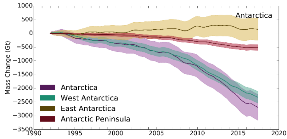
The shaded bands in the figure above aren’t even labeled, but they are no doubt intended to represent a type of uncertainty. It’s also peculiar that all bands narrow at the beginning. This means the scientists have the most confidence in their oldest data and the least confidence in their newest and more expensive data. Try to rationalize that if you can.
After all of the millions if not billions spent to investigate, all that the scientific teams can truly say is that a small fraction of the continent MAY be losing some ice. But these facts are hidden within legalistically framed papers with tons of small print. It also appears clear that Dr. DeConto and his team cite those papers to incorrectly assert an accelerated ice loss for the entire continent. If we all buy into these alarming claims, we will no doubt have to sacrifice more freedom and cash. Would he have anything to say if it turns out that I’m right and he’s wrong? I’m always happy to communicate with any of the authors of any of the papers I’ve cited.
MEDIA FEEDBACK UPDATE
I thought that the data-based evidence of a cooling Antarctica might be newsworthy, so I’ve shared this post with the Ars Technica popular media site. Here was their response:
Hi Michael-
I am not nearly as stupid as you seem to think I am. ..Congratulations on discovering ozone depletion, though. I do think you may have been beaten to that particular achievement by several decades.
Cheers, Scott (Johnson)
I’ve seen worse, but for some reason, Scott also asserted that I claimed to discover the ozone hole. In any case this is a good opportunity to invite you to also visit my posts on ozone. I never claimed to discover the ozone hole. It would be moronic to do so. I do appear to have re-discovered the high inverse correlation between atmospheric water and ozone, and all of my ozone posts focus on that ongoing exploration. I’m certain other scientists know about this “caustic” effect of water vapor on ozone, but none will publish it. That would drain the Montreal Protocol.
References
[1] Morrison, A.K., Frölicher, T.L., and Sarmiento, J.L. 2015. Upwelling in the Southern Ocean. Physics Today 68, 1, 27 doi: 10.1063/PT.3.2654
[2] Griffies, S.M., Winton, M., Anderson, W.G., Benson, R., Delworth, T.L., DuFour, C.O., Dunne, J.P., Goddard, P., Morrison, A.K., Rosati, A., Wittenberg, A.T., Yin, J., and Zhang, R. 2015. Impacts on Ocean Heat from Transient Mesoscale Eddies in a Hierarchy of Climate Models. Journal of Climate 28 pp. 952-977 Doi: 10.1175/JCLI-D-14-00353.1
[3] DeConto, R.M., Pollard, D., Alley, R.B, et al. 2021 The Paris Climate Agreement and future sea-level rise from Antarctica Nature 593, 83-89
[4] Shepherd, A., Ivins, E., Rignot, E. et al (2018) Mass balance of the Antarctic Ice Sheet from 1992 to 2017. Nature, 558 . pp. 219-222. ISSN 0028-0836
*By the way, an area can both cool down and LOSE ice especially if not continually replenished by more moisture. I’m not trying to conflate the two, but since virtually all polar scientists are fixated on temperature, I have to try to meet them halfway. I might really alienate them if I also shared that an area can also both warm up and GAIN ice.