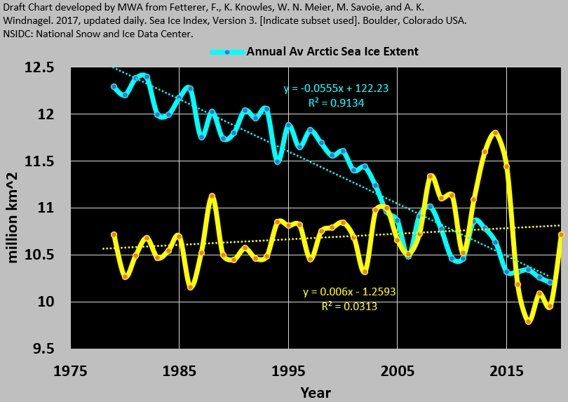
One can at least interpret from the featured time series of sea ice, that in the Northern Hemisphere, sea ice has trended down, but the reverse is true for the Southern Hemisphere. And, if sea ice trends up, only cooling can explain. It doesn’t seem that the entire planet is cooling. Rather for several decades, based on satellite reanalysis products, the Earth appears to have been cooling across its southern third, stable across its middle, and warming across the northern third.
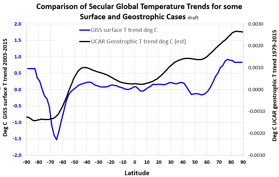
This has not been explored in public by any, except here it seems. And there are numerous questions worthy of further exploration. In this example below, the NASA GISS surface temperature trend appears to contradict the featured image above for Antarctic sea ice. Again, if sea ice expands, temperatures must be dropping, but the blue NASA GISS curve depicts a positive temperature increase trend across much of Antarctica. That trend is clearly challenged not only by the actual expanding ice, but also by the geostrophic temperature trend represented by the black curve.
Perhaps NASA GISS would benefit to transparently compare their land station data to the satellite records. There are a few who have puzzled in a low-key way about related inconsistencies of the climate time series that I’m also interested in. I’d like to close the loops as much as any, so I reach out to others working in the field from time to time, and vice versa. Here’s an updated example of work in progress on annual global temperatures by year and latitude I share.
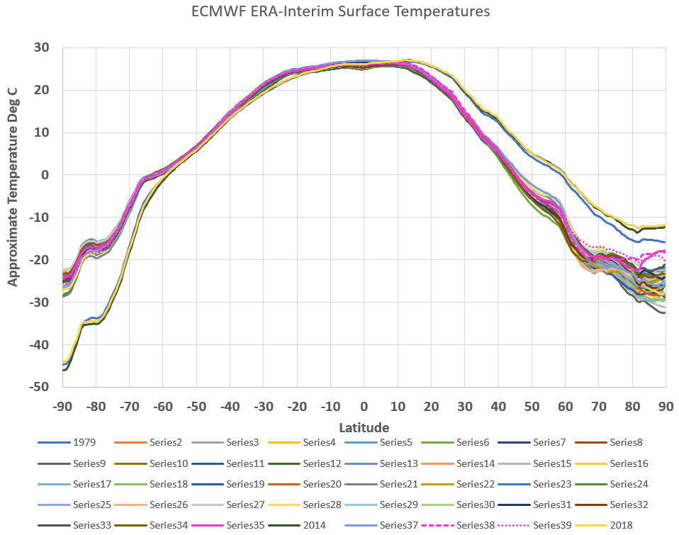
These are interesting, because the temperatures appear to only significantly vary at either pole, especially the North one. There are some anomalies of interest. Three of the time series are labeled by year (1979, 2014, and 2018) and reflect a distinctly different profile than the other years. I’m not sure if this is natural or not, in part because the anomalous years are always endpoints of the data sets. I discuss more later in this post.
Anomalies in most fields are items that stand out as possibly out of line, due to error or other causes. In comparison, NASA GISS temperatures use an anomaly convention which only really means an arithmetic departure from another number that they assign. It’s a rhetorical problem because anomaly implies something not normal. Antarctic scientists and others may be starting to sense some further disconnects between alarming temperature trend claims of NASA GISS and alternate trends from the mainstream satellite records. At least part of what the researchers now say is perhaps more true than before. But the devil is in the details of which parts. Here’s a recent example:
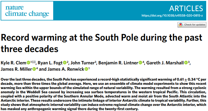
The title “Record warming at the South Pole during the past three decades” appears to be challenged by satellite data. The authors actually attribute natural variability to this warming, but their natural explanation leaves me frigid-cold, because the South Pole is normally dry and is always very far from the Weddell Sea. Moreover they don’t mention their natural causation notion in their title, leading most to likely assume the paper is confirming emissions based warming.
If only more scientists could focus on the satellite coverages, and de-couple from the anthropogenic models, then perhaps something worthwhile could be explored and advanced with lightning speed. I mentioned that the sea ice record doesn’t show the whole world is cooling (yet). But the epic swings in ice extent recently, across both poles now, seem anomalous also. Ultimately a scientist would like to get to the bottom of the question of whether or not these polar patterns are natural, and if so, what makes them tick? Or are there behind-the-scenes struggles in regard to those sea ice charts? We could help by asking lawmakers to ensure that robust quality assurance and quality control practices are enshrined in every organization of relevance, including NOAA and NASA.
Sea ice and air temperature are related, and as hinted above, the temperature records from satellite sources tell a different story than the NASA GISS temperature record. The recent comparison below is built on typical standardization of three independent time series of global annual temperature. For NASA GISS (red), that’s nominally from surface temperatures but again I had to work from their anomaly convention. I’m very much a fan of the full atmosphere and so I’m comparing that Nasa series to the UCAR global temperature trend (black) for the same time frame. Finally, I’ve included the ECMWF series for surface temperature (cyan). It is interesting that the UCAR and ECMWF series have almost identical trends. And the NASA GISS trend is twice as steep as those two. All of these cannot be right.
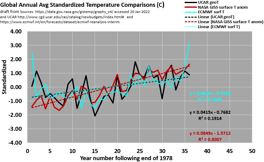
Those who read posts here might appreciate how thoroughly the atmosphere mixes from the top to the bottom. This may explain why the UCAR full atmosphere and the ECMWF surface temperatures indicate similar trends. In that perspective the NASA curve excludes most of the atmosphere and produces a steeper trend. Perhaps the anomalous endpoints of the ERAI information above also might merit temporary removal, just to see how those trends are impacted as well. This seems worthwhile to try to me and so here is a draft revision in that:
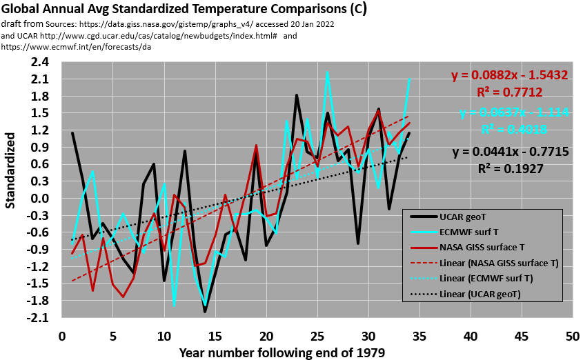
The bottom axis scale and titles have changed to reflect the truncated series. The result are interesting and also would shift the discussion somewhat. In any case, the NASA GISS temperature trend still appears to be about 50% steeper than the ECMWF surface trend. Both can’t be right. Ultimately however, it is best to show all of the years that are common to these three series, as the image preceding the above chart did. Perhaps there are natural states that the climate switches between which are captured by those years 1979, 2014, and 2018. But then, why do the ECMWF surface and geostrophic T trends appear to only best align when these anomalous bookends are included? I’m glad I’m working with people who like to try to quantitatively tune into the signatures for answers. Maybe our examinations can lead to something helpful in this regard.
Returning to the sea ice metrics, NASA Earth Observatory (NASA EO) does not represent the polar sea ice extents as anomalies., but refreshingly provides the metric in units of millions of square kilometers. They also note:
“From the start of satellite observations in 1979 to 2014, total Antarctic sea ice increased by about 1 percent per decade.”
Can you imagine the head of NASA GISS making such a statement? Not going to happen with the current director, who also moonlights with a climate change promotional blog. I’m glad however to perceive that NASA is not a consensus institution. I like NASA EO’s animation of Antarctic Sea Ice, with an average outline for Summer and Winter captured. It could be better, because currently the trends are not transparent. But in any case, it is somewhat improved over NASA’s GISS temperature presentations. If only media would cite this NASA resource as much as they cite NASA GISS. Perhaps all will improve graphics and then reconcile the expanding temperature-sensitive sea ice to the most representative temperature assets at their site.
Polar items also continue to somehow challenge reports of atmospheric CO2. There was a brief update on CO2 data, in 2016 from NASA Scientific Visualization Studio with a great animation of the observations by Cheng Zhang. Antarctica is not however captured by this series.
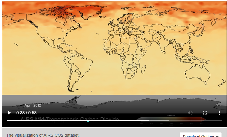
I had to caption that the atmospheric CO2 blooms every March through May across the higher Northern latitudes. Industry doesn’t shut down when Spring ends each year. If you don’t bring this up in your own socializing of everything, then you must believe that industry does shut down when Spring ends. I appreciate that these NASA researchers recognize the seasonality first and foremost. A team I participate in has been offered an opportunity to present some draft work towards a more robust causal interpretation of the Spring CO2 bloom and more, at a related venue soon, and I am looking forward to that.
In addition to reconciling temperature and sea ice trends, we all might benefit to rapidly corroborate from the actual data, whether or not the distribution and concentration of CO2 in the atmosphere is mainly tethered to a Boreal Spring Bloom. It’s all related but in any case I mentioned that CO2 can be observed by this AIRS series across the Arctic but not across the Antarctic. Meanwhile a parallel but less image robust program includes the Antarctic, but not the Arctic. Because it is less transparent so far, I can’t immediately corroborate and explore an Antarctic CO2 bloom possibility, but there is the suggestion of an Austral Fall bloom in that link. I’d be game to keep exploring and might have to soon look under the OCO hood.
Whatever these limitations for CO2 data, satellite reanalyses typically fill the gap through careful interpolations between well understood hydrodynamic and thermodynamic and chemical parameters. Here’s an example for global water vapor which I cobbled together from the first 20 days of ECMWF satellite-era data. Each frame captures a 6 hr increment:
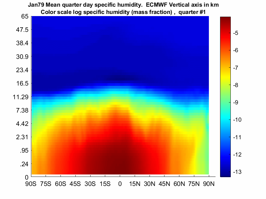
The ECMWF put the underlying data together. I just averaged across all longitudes for this animated profile. They have been a great resource for me and others to work and learn from. And as this post features, their reanalysis products can serve as a helpful sanity check against many climate claims, even though the reanalysis products may not be perfect either. The disparate satellite CO2 readings just described could also be shared in a streamlined and immediate manner by NASA with ECMWF. That would facilitate better transparency and then maybe similar animations of CO2 could be rapidly developed. I’m also grateful to Clive Best for noting and reinforcing to me at his blog site that the stratosphere reaches the Earth’s Arctic surface every winter. The green band above roughly representing the tropoopause, appears to corroborate.
I think that the NASA GISS temperature promotions are biased, simply because they don’t match sea ice or satellite temperature values. And with their crude anomaly convention, one can’t even interpret temperatures directly. Nor does that resource give any sense of how the full atmosphere relates. It’s almost as if they don’t believe that the atmosphere moves and mixes continuously. Finally, the content seems geared to only support a narrative of warming. If I’m right, then there is nothing of any scientific value in NASA GISS when compared with the alternate ERA-Interim vintage data sets, where temperature and related parameters are robust, fascinating and yet routine. With more weight given to this resource in everything climate, we might experience accelerated learning of the intimate and supremely important relationships between Sea Ice, Temperatures, the Carbon Cycle and the Hydrologic Cycle. That’s my bias.
draft, includes opinions, all rights reserved.