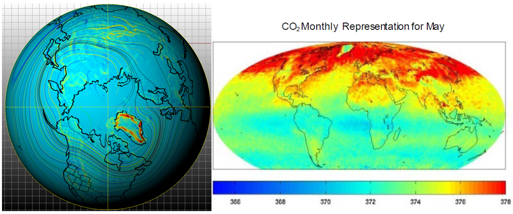
Greenland seems special in the above two satellite-anchored images. At left, for an example month of 1979, it stands out because a wall of almost continuously strong vertical wind jets surrounds its coast [1]. At right, Greenland perches like a lighthouse, above a fog of CO2 which appears to un-controversially emerge from the ocean each May [2].
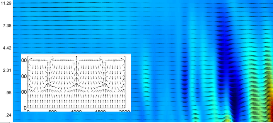
Until global climate models including the Community Climate Model, can accurately simulate the vitality of geostrophic representations featured in [3] and the above examples, I think there is a better way to model hydroclimate. The left featured image and below adapted from another post introducing a hydrospheric manifold term, show that even vintage hydrologic multistate multiphase calcs [4] can emulate the latent heat modulated convection of the atmosphere under climatic variations. Their approach to fracture growth and healing based on mass and energy changing states of fluids seems plausible to apply from some perspectives.
Again the building blocks appear to have the long term potential to match the vitality of our our monthly atmospheric convection. When this capacity grows, the seasonal April wind surge across the Northern Hemisphere will be recognized more widely, to induce a bloom of CO2 from ocean upwelling that circulates around the planet. The satellite data featured at the top already appear to support that as well. And the following short scientific animation indicates high velocity (dark) patches around the Southern Ocean surrounding Antarctica. I’m eager to develop long term representations to compare to other upwelling and cooling southern hemisphere topics that I’ve covered in the recent past:
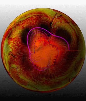
I can venture that these dark patches are unique fingerprints of Rossby waves. I don’t think any conventional monthly scale models exist with comparative fidelity, but I’m always interested to learn if one does. Without accurate winds all of the time and everywhere, climate simulations or other bean-counting methods will never adequately account for our atmospheric CO2 mass balance (within the atmosphere and via carbon cycle sources and sinks). And if climate change proponents and enforcers cannot simulate those accurately, they have no basis in using a global fossil fuel emissions driven climate model for prognostic or any other purposes.
As always, researchers are supposed to be interested in better data and better models. This should be a new goal for the fields of climate change and virus circulation. I contributed to [3] which can introduce one to the first gesotrophic virus circulation study based on some data but no models were used. A worthy climate model advancement (that still is on a learning curve itself) already in play is through Boussinesq assumption informed global quasigeostrophic models. They might work from this information to invert the coverage for the ocean’s geostrophic layer below. This can be argued simply because as noted often here, strong winds across bodies of water induce upwelling along the margins (coasts). The winds are strongest along high latitude coasts in both hemispheres over their spring months such as the average April featured at the top. Over a month on either side this is notable. Studies reflect that the upwelled dissolved inorganic carbon (DIC) degasses most significantly over this period. Accordingly the winds of our surface can be considered as a seasonally driving boundary of the ocean. That’s not controversial or original for me to say it, but it is clear that the climate change models we commonly hear of don’t capture this with any fidelity to observations

Instrumentally based ocean pH depth maps of these areas would without question help to show patterns of upwelling and downwelling that align with the inverted convection in which the base is at the top (because of winds). Here’s an older example of the depth profile for several parameters including pH as the “dark horse”. These signatures vary considerably between stable, upwelling, and downwelling areas, but so far as this data appears to show, the instrumental pH has a nice alignment with the dissolved oxygen. I have written about that in a post about dissolved inorganic carbon, and of course many other references, including [5] are available for further exploration of this broad topic.
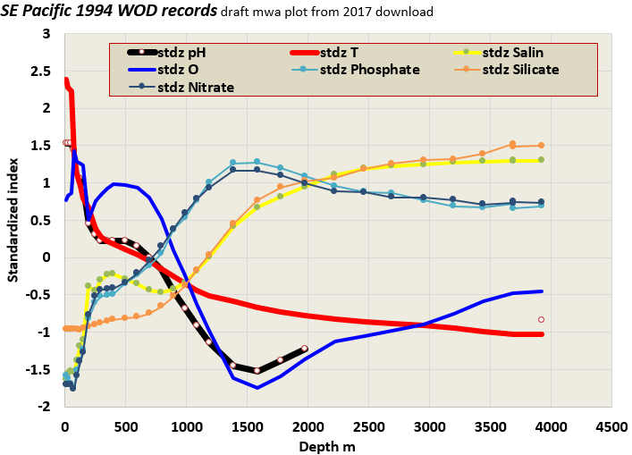
Any coupled climate and ocean model would be expected to at least capture the condition of dissolved oxygen. And that pattern with depth can point to upwelling and/or downwelling, just as instrumentally measured ocean pH, or even simply pelagic temperature can.
Recall that the featured image at the top represents the satellite integrated observation of seasonally enriched (May) atmospheric CO2, due to upwelling and related exsolution of dissolved CO2 and other gases. The annual May plume appears to be real. Accordingly again, current models might improve if they focused on capturing this seasonal and distinctive pattern of a May CO2 bloom with great fidelity. These are clearly related to the associated winds. The models would hopefully get this connection down with some confidence if possible.
Model Challenge: If any global circulation model (GCM) can simulate this actual seasonal pattern of carbon dioxide emergence and dissipation, that would be important to share. It’s equally important to share the models which cannot. I’m going to speculate that currently, none can achieve this skill.
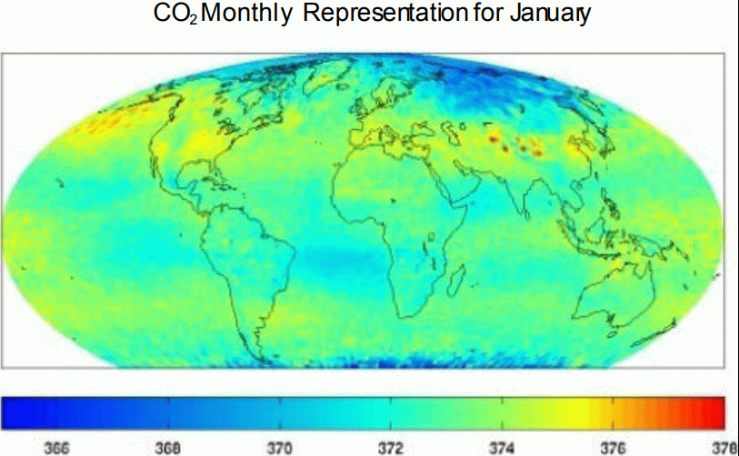
It would be awesome if readers could simply download the supporting reference to this animation, which is [2] below. Unfortunately, the taxpayer funded study is paywalled.
It doesn’t make sense, because NASA, the sponsor of the work, posts many items, even old items with vague disclaimers, that claim the opposite of what [2] signifies. For some reason, this seasonal satellite CO2 work hasn’t been publicized by its NASA host or any media or lawmaker or investment-climate-czar ever. Consider utilizing your local library or emailing NASA directly.
references
[1] Image developed by Wallace, extracting surface vertical winds from https://www.ecmwf.int
[2] Pagano, T.S., Olsen, E.T., Chaine, M.T., Ruzmaikin, A., Nguyen, H., and Jiang, X. 2011. Monthly Representations of Mid-Tropospheric Carbon Dioxide from the Atmospheric Infrared Sounder. Proceedings Volume 8158, Imaging Spectrometry XVI; 81580C (2011) https://doi.org/10.1117/12.894960
Event: SPIE Optical Engineering + Applications, 2011, San Diego, California, United States
[3] https://www.nature.com/articles/s41598-021-96282-y#Sec8
[4] A. Chaudhuri, H. Rajaram, H. Viswanathan, G. Zyvoloski, and P. Stauffer 2009 Buoyant convection resulting from dissolution and permeability growth in vertical limestone fractures GEOPHYSICAL RESEARCH LETTERS, VOL. 36, L03401, doi:10.1029/2008GL036533, 2009
[5] Rykaczewski, R. and Checkley Jr., D.M. 2008 Influence of ocean winds on the pelagic ecosystem in upwelling regions PNAS 105 5 1965-1970 https://www.pnas.org/content/pnas/105/6/1965.full.pdf
image in body of post: Background: Wallace post on hydrospheric manifold. Insert: from [2]