Your Winter, Your Summer
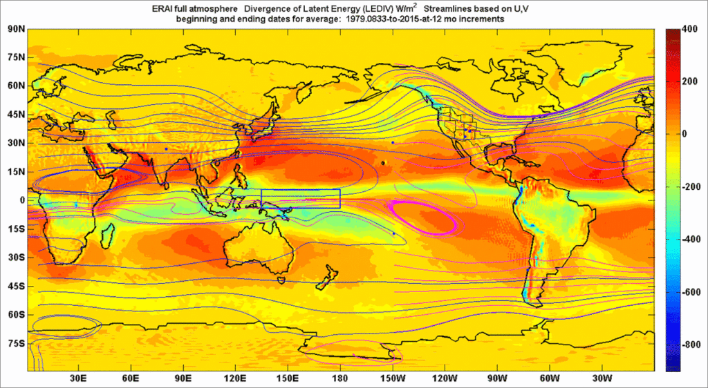
The featured animation demonstrates roughly the average state of divergence of latent heat for the full atmosphere anywhere across the Earth, including for your winter and your summer. Simply examine your neighborhood.
Perhaps some other info might be helpful or just interesting:
This figure is adapted from Wallace (2019). It is a representation of the heat that is injected into (or extracted from) the full atmospheric thickness of any air column purely from condensation (or evaporation) from that neighborhood. The bluest blues are expected to correspond to relatively highest precipitation for example, and the ruddy hues stand in for the most heavily evaporating regions.
Any change in color represents a gain in, or loss of heat, which is purely a consequence of the moisture’s state changes. There are some color patterns in more arid zones that are interesting to me at least: Often a yellow hue designates relatively greater precipitation in comparison to surrounding areas. So in New Mexico, the North American Monsoon (NAM) is easily seen in the summer by virtue of the vast yellow swath.
The Great Lakes Area is interesting to see and not see, just as the other post link shows.
Hawaii’s “stationary dimple” to its northeast is interesting if only because very few locations around the world have stationary weather regardless of the winter or fall season.
The stationary ruddy band which separates Africa and the Middle East from the Indian Subcontinent and which parallels in part the Arabian Sea, merits further discussion towards the end of this post.
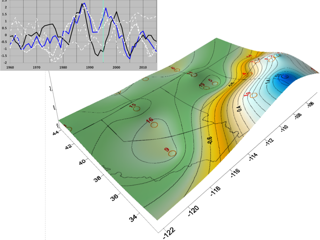
Note: the circles and dots represent some stream flow and ocean atmospheric record locations which I’ve looked at over the past semi decade.
A more nuanced representation of atmospheric moisture can be seen at this post.
The Bluest Blues and the Ruddy Hues
Honestly this is only a blog. Some of the underlying work on my side still turns around the so-called Walker circulation, along with the alleged Intertropical Convergence Zone. These geostrophic maps featured in this and other posts, appear to capture a more tantalizing picture than those terms.
In describing geostrophic circulation it might benefit to read some of those past posts. Other resources are available but they don’t appear to capture the “global” part. It also seems that in describing geostrophic circulation, one can adopt new parallels and metaphors. While somewhat simple and mechanical, these can help to capture the challenging patterns of global atmospheric moisture and its other gases. The featured animation points to an important parallel. It suggests not only latent heat but the moisture concentrations which drive it, from its heaviest bursts of water in blue, to the vast and ruddy gyre-fueled evaporative fluxes. Moreover, all to me appear to follow every solar peak like the ringing of a bell.
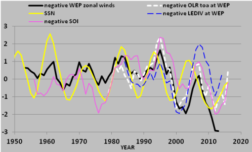
Why a bell metaphor? Again from that paper, I’ve elected to compare a solar time series in yellow to some of the interesting and often lagged variables including the featured divergence of latent heat and its close companion the Outgoing Longwave Radiation (OLR) parameter. Both of those come from the ERAI resource, again, and their location is associated with the western equatorial Pacific full atmosphere.
The solar energy spike in this case above is for a semi-decadal average time frame, in order to explore the impact of solar cycles. Even so, the bell metaphor is appropriate. Imagine striking a church bell, and slowing down the time recording so that each second takes a year or two.
Returning to a seasonal framework, the following two animations parallel the featured latent heat animation, because they display more specifically the associated atmospheric moisture coverage. As I mentioned, latent heat divergence is only possible when water changes state. In these images the deepest blues represent the greatest intensities of precipitation and the lightest greens represent the greatest intensities of evaporation. The images are somewhat different in timing from the featured one, simply in order to add spring and fall to the summer and winter already shown initially. The first covers that change in moisture from the boreal winter to its spring. The second covers the same from the boreal summer to fall.
To help explain the geostrophic circulation which underlies these images, a “gear” metaphor between the easterly Equatorial Trough (ET) to the spinning gyres is introduced. The two gears are adapted from my paper’s focus of the trade winds, OLR and LEDIV over the western equatorial pacific (Wallace, 2019). My paper also mentions the other major gyre locations already examined in prior literature (western hemisphere, same tropical zone). For the first of these animations, when the inner key (in the Northern Hemisphere gyre/gear) is pointed up, that is the climatological January. When the inner key of the upper gear ratchets to 1 o’clock, that is meant to represent climatological April. As expected for this earth rotation time span, the upper gear has more “traction” with both the easterly and westerly flows of the NH.
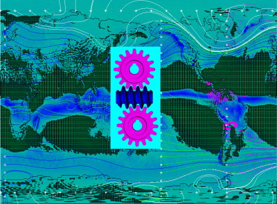
Note the natural connection of gear rotations above and below the equator to the actual gyre rotations, which in this selection are captured in part across Latin America by the magenta streamlines. The great geostrophic atmospheric gyres spin clockwise in the NH and counter clockwise in the SH. The complementary gif animation which follows covers the “descent” of the ET from its NH summer high in July to the October state. In this case, the northern gyre has less obvious connections to the NH flows, which makes sense.
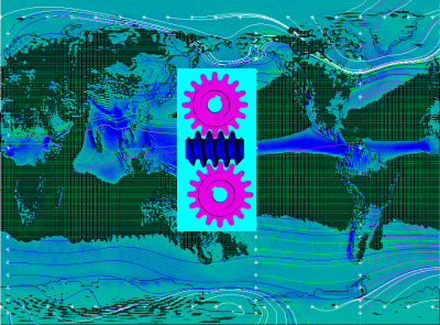
These animations are illustrative only. The actual speeds and persistence of gyre rotations are not captured, but the directions of the gear/gyres and of the atmospheric moisture are captured, rather well, I think. My paper is among the first to explore this moisture nexus from a standpoint that the Walker circulation is more multidimensional than conventionally represented.
A true mystery of physics remains that laminar eddies will always form in pairs around the equator of a spinning cylinder (immersed in a fluid). No physicist or hydrodynamicist can tell you why. The challenges compound for a spinning sphere. Also for what it is worth, my work may be the first to nominally explore the connection of Earth’s major (and roughly symmetric) gyres to this conundrum.
Did I mention that the green lattice parts of these images resemble nothing so much as foam caught up in non-circulating eddies? They do, and that also adds some conceptual value at least as a metaphor.
I continue to find additional lines of information which appear to corroborate the value of a geostrophic climate approach. For example, the composite image below compares the July LEDIV state from the initial animation, to the work on atmospheric deuterium isotope ratios by Bowen et al. (2003).
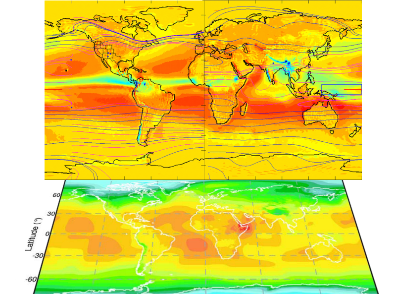
I think the Horn of Africa’s convergence of the deuterium hot spot (as well as the same for 18O) with the summer LEDIV might reflect in fact the very evidence that geostrophic maps are superior for circulation studies. Consider that ruddy band of intensely-evaporating moisture, hardly shifting north or south with each season along the western Indian Ocean. It defies the monsoon, but immediately to the west, the irrepressible and highly moisture-charged equatorial trough spills down into Ethiopa and Eritrea. This corner of the world appears to see more evapotranspiration than any other, perhaps because the circulation patterns are weak, while the evaporation is non-stop. I have little doubt that some of that newly evaporated (and already isotopically-concentrated) brew then re-condenses, to fall as rain across Africa’s Sahel and rainforests.
Further simplifications or useful geostrophic slices of information are possible. My paper (2019) developed accurate forecasts of actual mountain streamflows within high altitude catchments, even when I largely disregarded ocean and groundwater temperature and circulation. In other words, one can work from ERAI results as previous posts reflect.
Solar Forcing, latent heat, and greenhouse gases.
Some might notice from content in this post and others, that the energy flux from the Sun to Earth is in tune with the LEDIV. Both range around 240 W/m^2.
Forecasting and communicating about climate for your neighborhood
If one wanted to follow this hydro forecasting path for their own neighborhood, I would recommend that they first integrate standard meteorological variables across the vertical, but maintain the zonal and merdional resolution, such as I’ve done in the initial animation. For geostrophic approaches to work, one must consider an area of 1000 km radius or greater (according to geostrophic references). Whatever the scale, ERAI is often a good resource to start from. To follow through on hydrodynamic forecasting success in the direction I have gone, one must then develop solar forcing correlations. If those are high and there is a lag from the solar signal to the parameter of interest, then forecasting might be beneficial.
The vertical aspects of hydrospheric flows in any case appear to often be bit players over decadal spans, in comparison to the well-understood Coriolis-inflected geostrophic scale. For a global or regional scale, what is it about vertical that cannot be effectively represented in any case by geostrophic applications? You would have to ask the conventional climate scientists and others, who represent the global atmosphere often only as a thin slice, such as a surface layer, planetary boundary layer, tropopause, top of atmosphere, or some other pressure value. If there is any type of average or integration, of the full thickness, it is almost always then reduced to a single meridional profile.
References
Bowen, G.J. and Revenaugh J., 2003. Interpolating the isotopic composition of modern meteoric precipitation. Water Resources Research, Vol. 39, No. 10.
Wallace, M.G., 2019, Application of lagged correlations between solar cycles and hydrosphere components towards sub-decadal forecasts of streamflows in the Western US. Hydrological Sciences Journal, Oxford UK Volume 64 Issue 2. doi: 10.1080/02626667.2019.
 6139total visits,2visits today