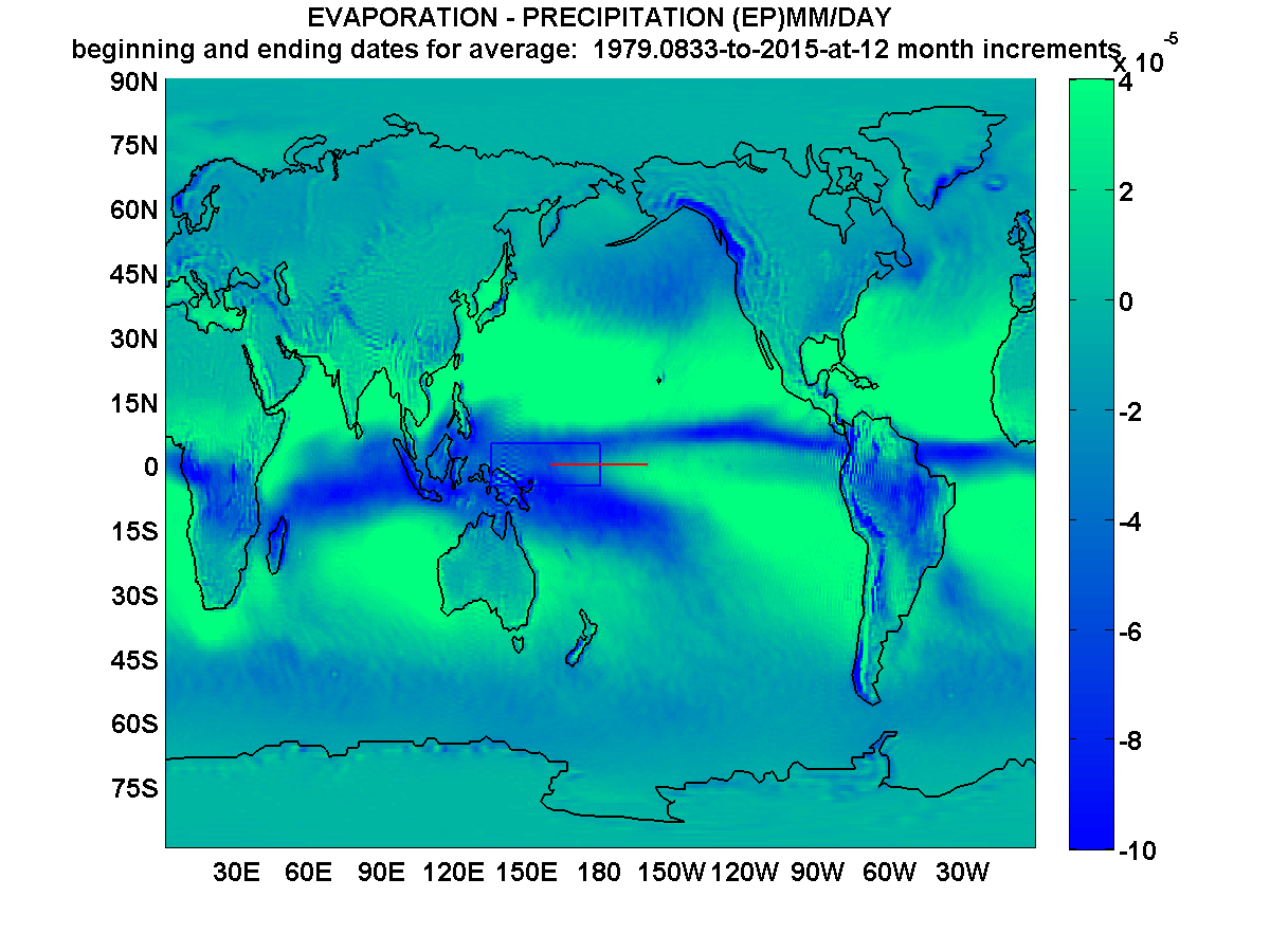
Geostrophic Monthly Global Moisture
I developed this featured animation based upon data, namely an ERAI, UCAR [1] integration calculation of the moisture of the full thickness of any part of the atmosphere month by month for an average year. The animation presents more answers and questions to any but the most uncurious. The 12-frame animation covers each average month’s full-thickness atmospheric moisture which is either precipitated or evaporated. The data is developed from satellite records spanning the years 1979 through 2014.
Click on image to animate
The deeper the hue of blue, the greater the relative amount of precipitation from the full atmospheric parcel. Also the brighter the hue of green, the greater the integrated amount of evaporation for the associated full atmospheric parcel [2]. This is why the large wedges of bright green occupy the greatest swaths of tropical ocean water. Notably if a parcel does not reflect net evaporation or net precipitation, then it is represented by a gray green hue. That can happen for dry continental regions which haven’t received precipitation for a month or so .
For example, the Great lakes of North America show up most clearly in the boreal Spring, as a recipient of atmospheric moisture, and then virtually disappear at times. At other times the Great Lakes, by virtue of their light green signature are indicated to add moisture to the atmosphere. A larger scale example can be seen across the Sahel of Africa. As the blue high moisture equatorial (trough) swings north and south each year across part of the continent, a light-green evaporation band with a one or two month half life follows. That appears to be the resulting evaporation and evapotranspiration from the soils and vegetation which had just received the rain in the previous months.
This all makes an excellent case for the common ground that geostrophic analyses share with the directions that modern day meteorology excels at. But as I continue to explore, I am finding a few hints that perhaps these types of analyses are more widely relied upon by meteorologic staffers of federal agencies than the typically assumed global circulation models, at least for the projections which extend more than one week. This would be helpful for all to know and I’ll keep advancing my explorations to understand more closely where the models end and other types of more auto-correlated analyses begin.
I think this animation also adds to the numerous resources which confirm that water primarily follows the Sun*. For context it is known through my paper [2] and others, that in addition to the most obvious orbital aspects of solar-driven moisture migration (the equatorial blue band which shifts to the north and south over the obvious seasons) there are also convective and cyclostrophic related transports of water via Hadley and Walker global circulation patterns.
The topics continue to challenge all efforts to more fully understand. Yet even at this early stage of growing solar – terrestrial climate connection awareness and forecasting utilization, there can be little doubt remaining that the actual hydraulic and thermodynamic signatures of a key nexus of the sub-decadal to decadal scaled Hadley and Walker circulation components, are driven almost purely by solar cycles. There are no other candidates that come close to the Sun for decadal climate forcing. The establishment of this hopefully provocative claim derives from the identification of that nexus more clearly, and subsequent lagged correlation and significance testing documented in [2] and often elsewhere at this site such as my routine forecasting disclosure page.
The Sun’s energy can be discriminated into many subdivisions, as far as the terrestrial recipient is concerned. The featured image identifies the most important tilted orbital annual component of a solar forcing effect at a monthly resolution. This forcing happens regardless of low or high total solar irradiance. As water vapor from the equatorial trough for example, rises closer to the tropopause, it is captured into a divergent upper atmospheric circulation towards either pole. As the water cools and condenses into ice crystals at high altitudes, it eventually subsides back into zonally flowing regions. This is a somewhat widely understood pattern but the animation perhaps allows for another perspective of its dynamic, which includes the widely cited orographic effects, along with the major monsoons.
Much evaporated water of course stays lower and simply flows laterally more or less along with the host dry atmosphere, sometimes captured in massive tropical gyres, sometimes flowing within zonal ‘conveyor belts’ and sometimes captured in polar circulations. The water that flows out of the ceiling of the lower atmosphere (PBL and/or tropopause) then back in, is the part of hydroclimatology that is among the most important areas of hydrologic research. Or it should be.
Through exploring the limits of the geostrophic representations, I believe I am finding new ways to approach those particular questions. In my geostrophic world, the hydrosphere is somewhat like an orbital river circulation that is “fueled” by the sun, with the poles as its two banks. The metaphor has some limits but at least it reflects a typical flat map of the planet such as this animation. To extend the metaphor further, I could point out that the moving blue band is not unlike the natural swings of a stream as it meanders across a flood plain. I could go on, and point to the incredibly stationary “sand bar” across the western to central equatorial Pacific. That pattern is closely related to my paper as well [2].
Given that this is only a blog, in good fun, the animation may well demonstrate (as can many other resources) that when water flies too high, like Icarus, it drops back into the everyday global atmospheric circulation. Unlike Icarus, water survives to fly another day, likely tomorrow or at least within the next month or so, as texts of atmospheric moisture residence times (based on stable isotope ratios) appear to relate.
[1] http://www.cgd.ucar.edu/cas/catalog/newbudgets/index.html#ERBEFs
files ‘ERAI.Z.1979-2014.nc, ‘ERAI.EP.1979-2014.nc ‘
[2] Wallace, M.G.,2019. Application of lagged correlations between solar cycles and hydrosphere components towards sub-decadal forecasts of streamflows in the Western US. Hydrological Sciences Journal, Oxford UK Volume 64 Issue 2. doi: 10.1080/02626667.2019.
*And not IR – active greenhouse gases such as CO2
 10499total visits,2visits today