
Moisture Across SE Asia Changes (Click to Animate)
The featured Temperature animation, and its Evaporation-Precipitation counterpart, along with recent posts, reinforce the well-known but poorly-distributed fact that ocean-evaporated moisture is the Earth’s Thermostat.
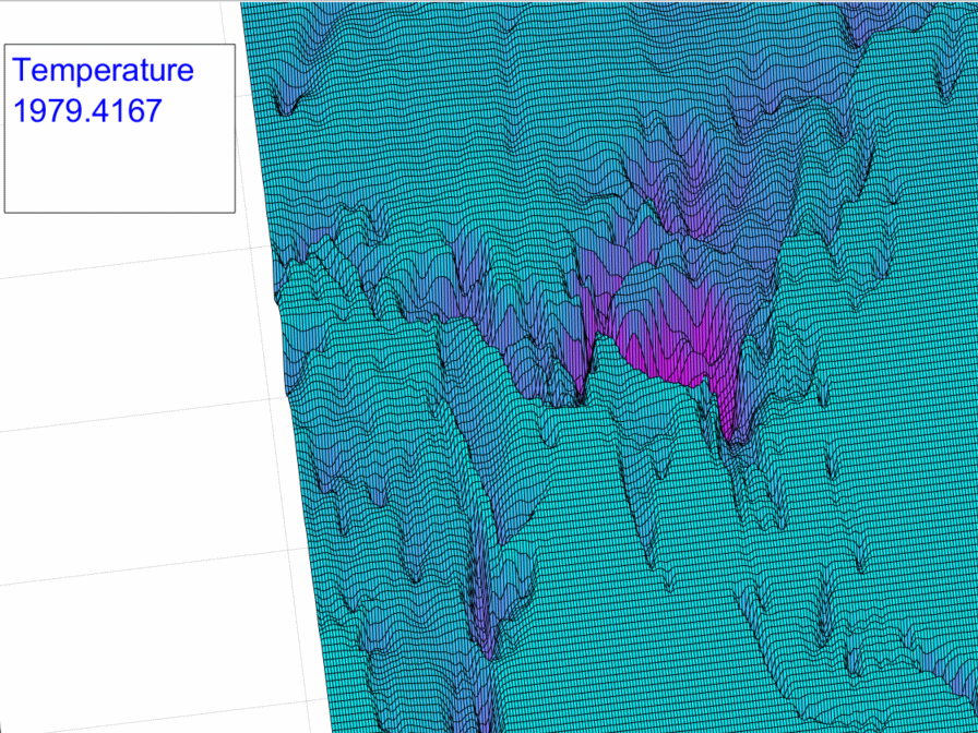
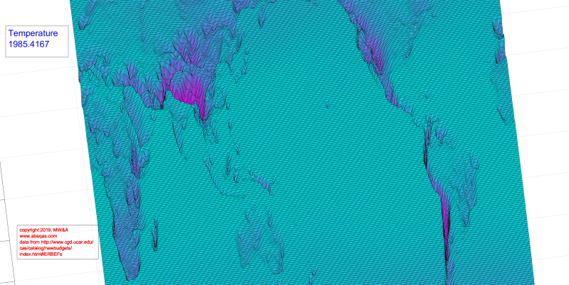
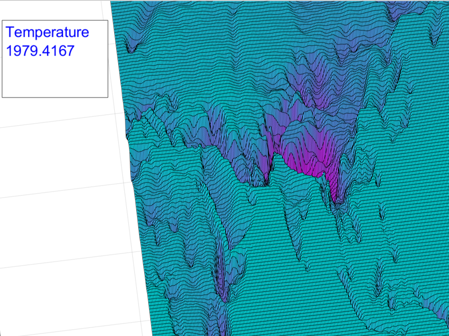
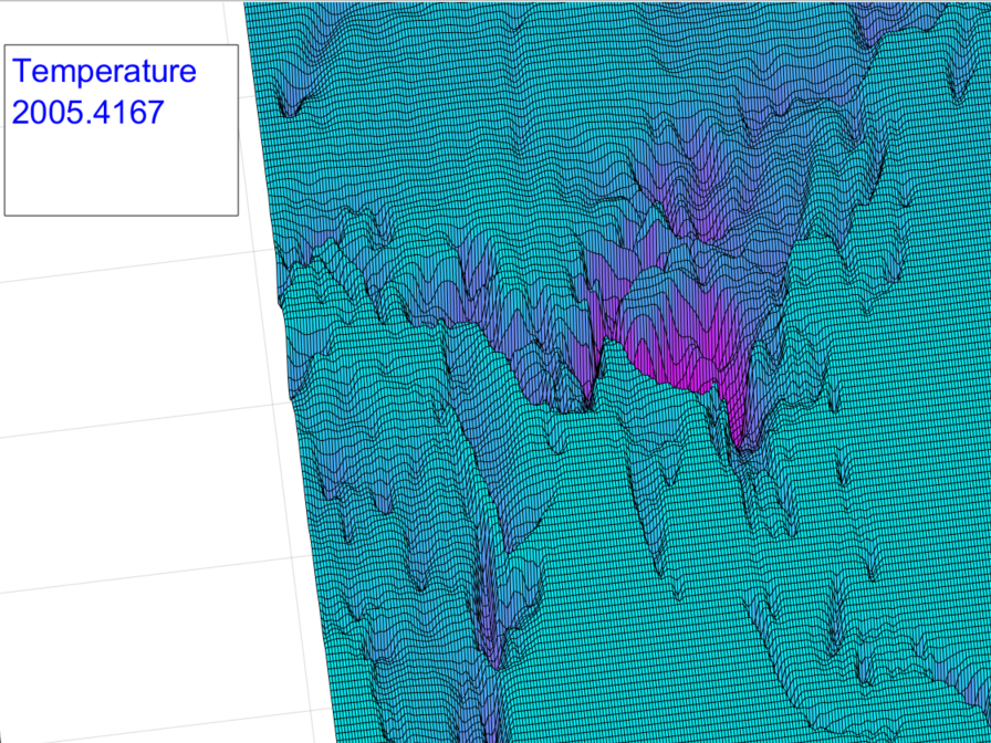
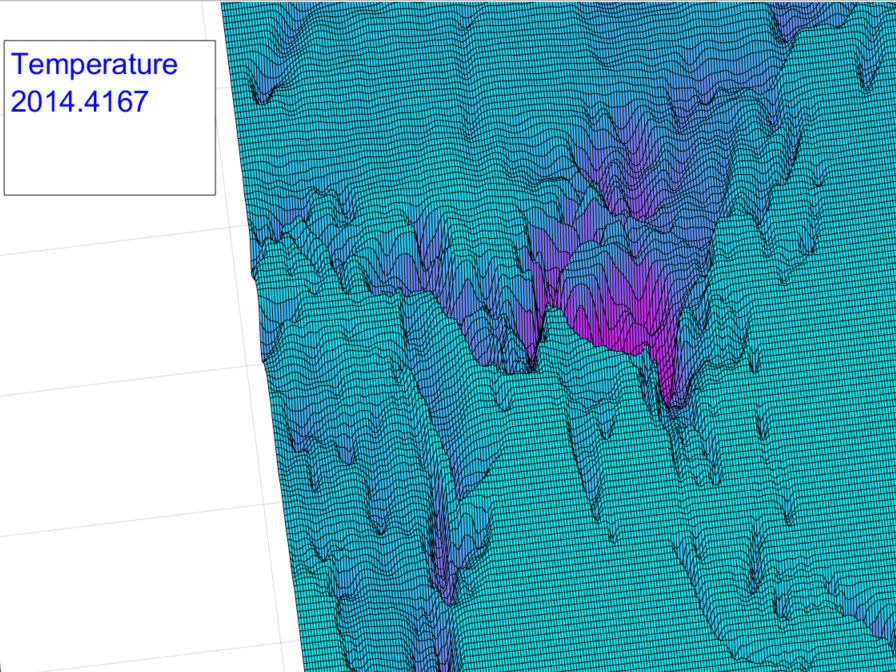
Both animations represent “surface plots” at an oblique perspective, of two-dimensional geostrophic maps. They cover a Southeast Asia region, and are derived from ERAI full atmosphere integrated satellite data [1] from the same month and years, namely May, 1979, 1985, 1995, 2005, and 2014. The two end points are the beginning and ending years of the data set I extracted from the resource a few years ago.* In the featured gif file at the top, the full atmospheric thickness equivalent Temperature (T) is mapped. The deeper, magenta surface patches indicate the lowest temperatures, and the highest regions indicate the highest temperatures. The continental and some island boundaries should be recognizable. India sans Himalayas truly stands out. On that note, any should be able to easily see that high mountainous regions such as the Himalayas, are the coldest regions as well. It is rather difficult however to detect any temperature changes across that region over the multidecadal time span.
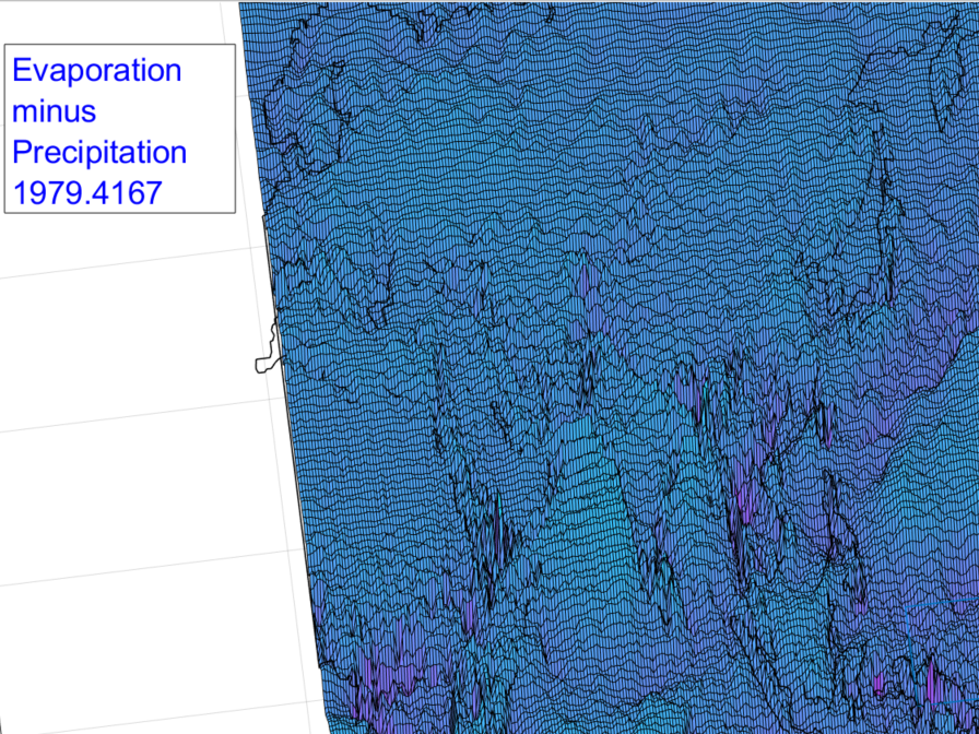
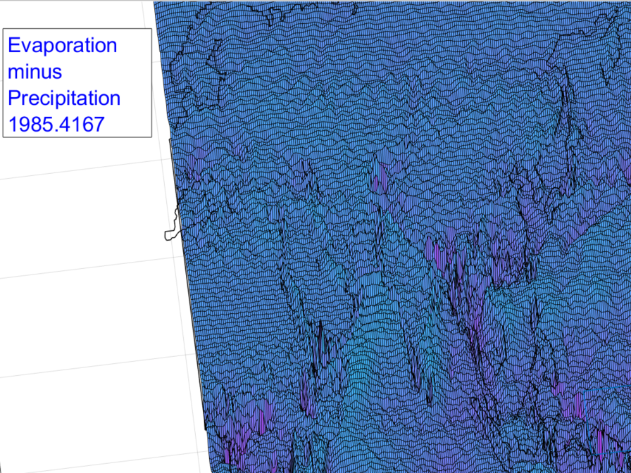
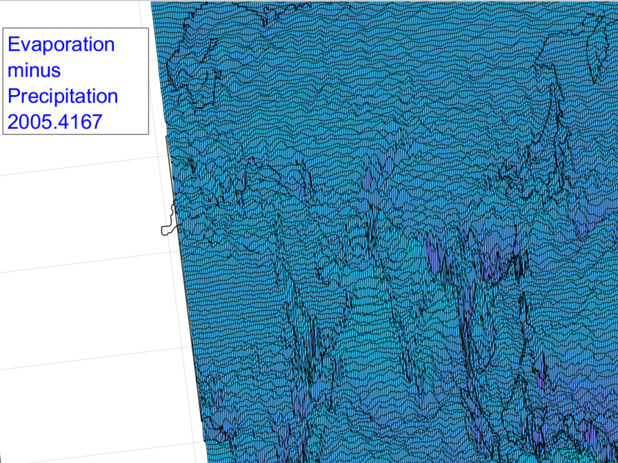
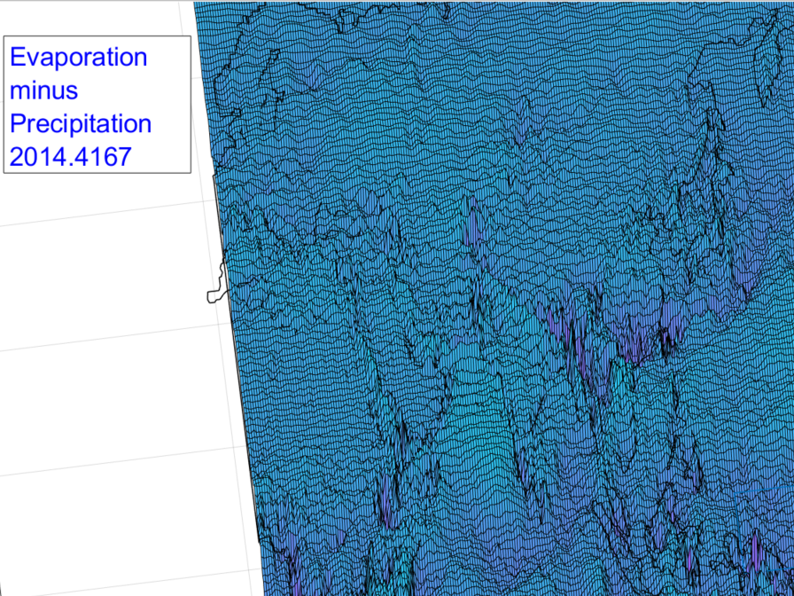
In the other animation, the furrowed Evaporation-minus-Precipitation (EP) result is shown, and again it is integrated across the full atmospheric thickness everywhere. In this frame, the same color scheme is used as before, but it means something quite different. The deeper and more “magenta” colored the surface region, the greater the amount of net precipitation. The higher and more blue the surface region, the greater the amount of net evaporation. In contrast to the first animation, changes for this set are relatively easy to identify over time, even as the continental boundaries are much harder to see. The moisture patterns are “messy” while the temperature patterns seem unusually stable.
Perhaps the most distinctive aspects of these maps are the vast and flat atmospheric temperature plateaus shown. Here’s a wider image from one of these temperature frames so that the scale can be appreciated.
Again those are air temperatures overlying all of our planet’s oceans. Compare that to the EP surface, which couldn’t be more rugged and ornate over the same areas.
There’s a good reason for this. The dynamic variability of the circulating moisture ensures the stability of the temperature. The oceans are the primary source of this atmospheric moisture. They respond immediately and directly to solar heating by evaporating. This is a significant non-linear process which rapidly wicks the applied heat into the atmosphere. Once there, circulation and radiation of heat to outer space maintain Earth’s remarkable temperature equilibrium.
The contrast between the two image sets is simply the result of ordinary solar forcing of a watery planet. Returning to the EP file, one can observe that the greatest ‘mounds’ of evaporation occur over the oceans. Those oceans are the same regions where the temperatures are the flattest. Again, the moisture does the heavy evaporative lifting to maintain the temperatures over the oceans within an equilibrium state.
This natural phenomena happens to be somewhat equivalent to the essential use of circulating water to control the temperatures of reactors. Here below is an example from Figure 1 of R. Hu, 2017 [2], which I’ve flipped upside down. In this context the heated (red) surface of the reactor component can represent the heated surface of the Earth. The circulating and thereby heat-wicking water is depicted by the arrows, which indicate convection. Astute observers will recognize the flux boundary conditions along the two sides. Consider those to stand in for the greater atmospheric circulation in this analogy.
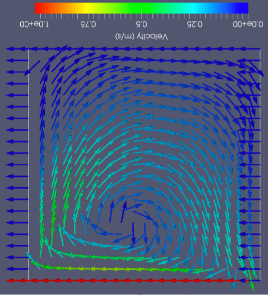
After Hu, 2017
The remarkable heat conducting and convecting properties of the continuously flowing water, work thermodynamically to ensure that the reactor doesn’t overheat. The temperature of the hot surface is maintained precisely to a desired flat and constant level. Any who have read of reactor safety can appreciate the importance of this control process. Again, in my perspective, the same processes apply to our planet, without any human engineering required.
To recap, as often noted in related posts, the watery properties of the planet could not be more dynamic and variable. The temperature properties could not be more stable. It is the dynamic variability of the circulating moisture which ensures the stability of the temperature.
This example set expands on the assertion by simply laying out each image of the two animations for direct comparison.


These paired images also support the following chart, from a recent post which indicates that temperatures of Earth’s full atmosphere have remained flat for decades. The black curve is an average of all atmospheric parcels across the planet. The red curve captures temperatures from the center-right edge of the animation frames (western equatorial Pacific). The green curve captures temperatures from a region within the Southern Rocky Mountains in North America.
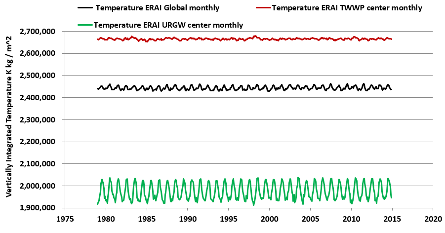
How is one to reconcile this extensive evidence of practically zero temperature fluctuations against the greenhouse gas theory? That is a challenge we all can pose to those who claim to believe in that notion. I choose to believe in the data, along with ordinary and highly reproducible thermodynamics and hydrodynamics on a planetary scale. For whatever else it might be worth, some will be surprised to learn that the greenhouse gas theory/notion has never been successfully demonstrated in any laboratory, no matter how sophisticated or well-funded. Nor have any ghg models ever approached a plausible or accurate global simulation.
This site focuses on alternative scientific views simply because of its own research directions. Accordingly it features many informal viewpoints along with guest posts by other solar – hydroclimatology related scientists, along with summaries of peer – reviewed published papers regarding Earth’s Solar-driven heat patterns that relate to the hydrosphere.
In my view, should solar irradiance rise, such as in times of peak sunspot activity, then there will still be plenty of ocean water to work its thermodynamic magic, by evaporating and transporting and recondensing at higher altitudes. I think it is easy for any peer to determine that I am on the right track, if only from the related signature of divergence of latent energy which always matches the solar irradiance to the Earth’s surface [3, 4]. Also the above chart demonstrates for example that temperatures over the satellite record, covering more than three recent solar cycles, do not express any noticeable trends or cycles other than the usual seasonal one. Obviously they don’t indicate any greenhouse gas effect either. On the other hand, as my recent paper [3] appears to prove, moisture does show an appreciable solar-forced impact.
Preview animation: Finally, here is another full atmosphere thickness temperature animation for the same time frames but with the focus shifted to North America. I may use this as a featured animation for a subsequent post with slightly different topical coverage.

Temperature Across North America Hardly Changes (Click to Animate)
REFERENCES
[1] http://www.cgd.ucar.edu/cas/catalog/newbudgets/index.html#ERBEFs
files ‘ERAI.Z.1979-2014.nc, ‘ERAI.EP.1979-2014.nc ‘
[2] Hu, Rui, 2017. Development of a Reduced-Order Three-Dimensional Flow Model for Thermal Mixing and Stratification Simulation during Reactor Tansients. 17th International Topical Meeting on ..Thermal Hydraulics ETH-17 September 03 -08, 2017 Xi’an, Shannxi, China
[3] Wallace, M.G., 2019, Application of lagged correlations between solar cycles and hydrosphere components towards sub-decadal forecasts of streamflows in the Western US. Hydrological Sciences Journal, Oxford UK Volume 64 Issue 2. doi: 10.1080/02626667.2019.
[4] http://www.abeqas.com/your-winter-your-summer/
*The resource at [1] can also be accessed for a deeper understanding of the associated units and how they are derived. I’ve independently confirmed those myself, and it is a good exercise for any climate student.