Still advancing from the hydrogeostrophic frameworks, which appear now to be gaining more traction via [1] and [2].
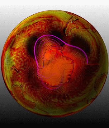
The featured animation above includes a variation of the vector-size pattern effect shown earlier. Here the focus is on the Southern Hemisphere The heart-shaped magenta streamlines signify to me that the image is for April 1979, followed by same for April 1980 and for April 1998. I chose that for a semi random reason (not entirely random).
The first month of the three-frame animation is included below at relatively high resolution. There are some potentially radical interpretations, keeping in mind that the dark patches indicate heightened geostrophic annular velocities for the most part. Also one needs to recognize the “groove” pattern is simply an artifact of the origin of each (tiny) arrow. And some concentric patterns are likely spurious moire results. But the rest are virtually all very resonant data. For example, the magenta streamlines emerge from a tight circle at about 80 degrees south. The termination of many at 3 o’clock is an artifact of the seam from my wrapping of this chart around a sphere.
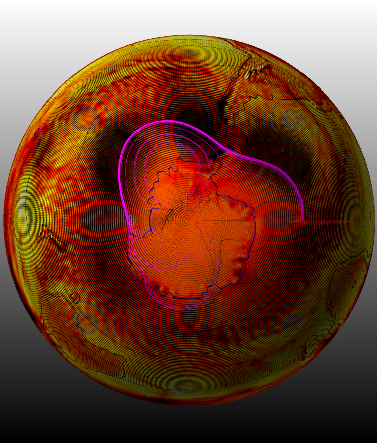
Also the rivulets of red seem to suggest streams of atmospheric moisture flowing down from high pressure regions. That would be bizarre, that a stream can form in the crevices of the dynamic atmosphere, and in any case, I’ve been wondering about these cousins to “atmospheric moisture waves” for some time. These “furrows” are not exactly the same as popular descriptions of atmospheric rivers. These furrows are present all of the time, while the atmospheric rivers have much less persistence although they also flow “down” from the higher (Z) subtropics to the middle latitudes.
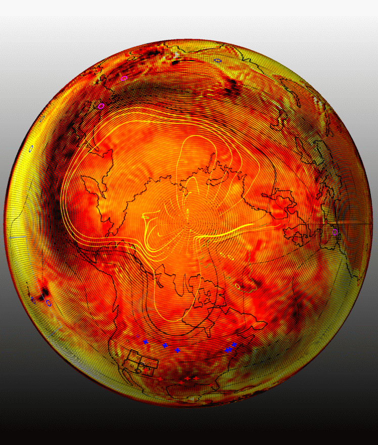
Perhaps both the rivers and the furrows make up a very dynamic “watershed” that shares the same conceptual and physical space with convection fronts. Here’s a more ambitious size of same animation for the Northern Hemisphere, otherwise same months and years.
One wonders why the patches of high velocity flow (dark patches) appear in such strange and often paired arrangements. If this has been observed and published before, I’d be interested to see.
References
(new) [1] Wallace, M.G., and Wang, Y. 2021 Pollen antigens and atmospheric circulation driven seasonal respiratory viral outbreak and its implication to the Covid-19 pandemic. Nature Scientific Reports 11, Article number: 16945 (2021)
[2] Wallace, M.G., 2019, Application of lagged correlations between solar cycles and hydrosphere components towards sub-decadal forecasts of streamflows in the Western US. Hydrological Sciences Journal Volume 64 Issue 2. doi: 10.1080/02626667.2019.