Relative Rainfall and Climatological Sea Levels: Two Satellite Views
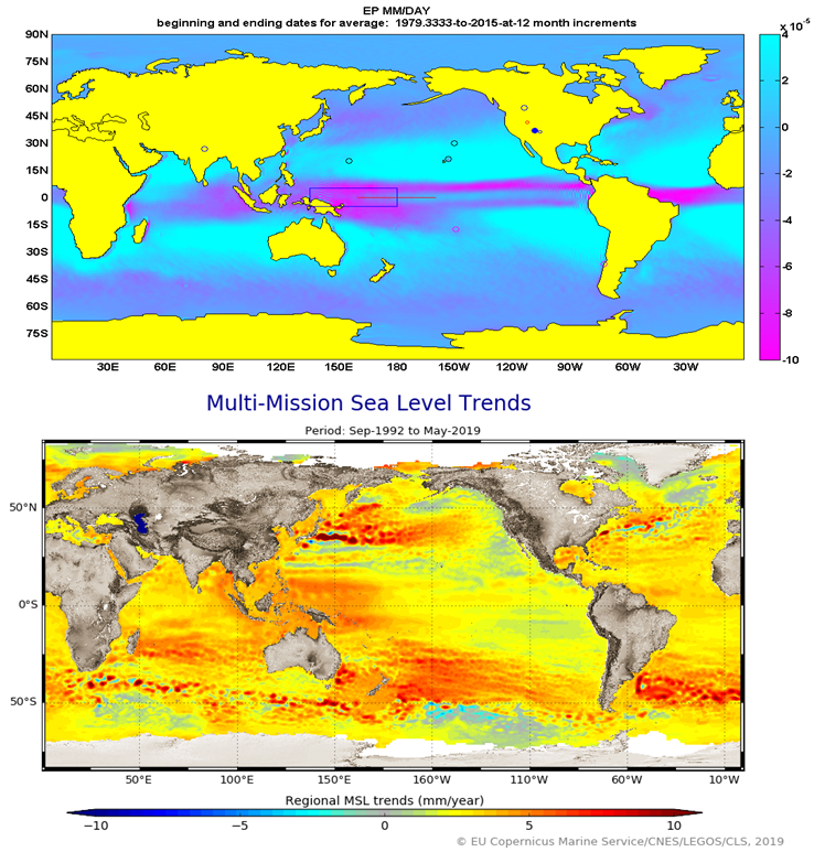
This post shares some interesting parallels between sea level trends and a sample global geostrophic ERAI coverage of a key atmospheric moisture parameter. In the top panel, of the featured image, I’ve placed an average March ERAI full atmosphere representation of Evaporation minus Precipitation EP [1]. In this coverage, the greatest relative amount of precipitation is represented by the magenta coloring. At the other end of the color scale, the cyan fields indicate where evaporation exceeds precipitation. I’ve filled in yellow over the continents to allow a focus on what happens over the oceans. There are other annotations from past work and some relate, especially the circle next to Hawaii, and that is explored in a later post and more.
In the lower panel of the featured image, I’ve placed a graphic from the AVISO sea level altimetry resource [2]. That image is also an average over several decades, but in this case the parameter is sea level trend. The greatest rates of sea-level rise are identified by the red zones. Some parallels are evident: Overall, it appears that the highest rates of precipitation are aligned with the so-called highest rates of sea level trend.
Although the AVISO flow charts of moisture contributors to sea level calculations mention precipitation across the land surfaces, they don’t appear to identify precipitation across the oceans. Rather, the primary driver to explain climatological sea level trends is attributed as glacial and ice cap melt [4].
Even so, this work may actually complement AVISO. Extra water that rains over oceans must come from somewhere after all. Moreover, the gradual rise of sea level is widely accepted and has long been attributed to a gradual emergence from a past Little Ice Age as well as over a longer term, from the past big Ice Age. AVISOs representation and integration of mean global-scaled sea level since the early 1990s seems impressive to me. I’m interested in sub-decadal scale representations of the full hydrogeostrophic planetary domain. As I noted, the added moisture has to come from somewhere, and glacial melt if confirmed could corroborate. Obviously from past posts, I have found contradictions in a number of glacier / ice cap mass change estimates, but the field is still young.
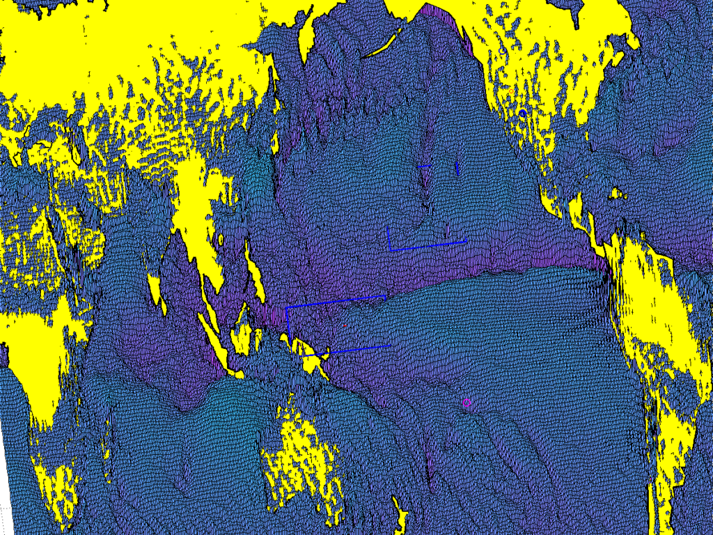
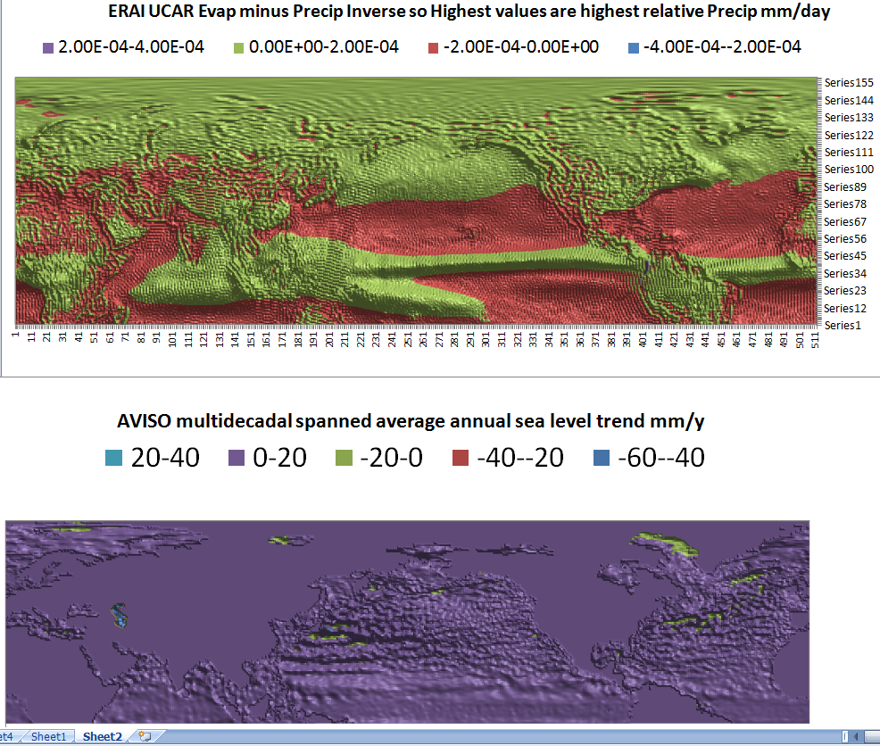
The connection between rainfall masses and vast regions of elevated sea level continues to bear out at least in my preliminary work. In the paired maps below I’ve adapted to the AVISO data to share the same resolution as the ERAI atmospheric moisture data. I’ve also reversed the customary range for the EP atmospheric moisture parameter. It is now somewhat more apples to apples or maybe apples to pears. The sets overlap and both cover a few decades. They are both at the same monthly and spatial resolution. And where the mounds are highest that means the greatest relative precipitation in the upper panel AND the greatest relative sea level trend in the lower panel.
In any case, this was a limb of exploration which has expanded upon the connections already described in Wallace 2019.
[1] UCAR ERAI Source: Available from http://www.cgd.ucar.edu/cas/catalog/newbudgets/index.html#ERBEFs
[2] https://www.aviso.altimetry.fr/en/data/products/ocean-indicators-products/mean-sea-level.html
[3] Hotz, Robert-Lee, Thursday September 26, 2019, “U.N. Panel Sees Threat to Oceans” The Wall Street Journal
[4] UN IPCC Special Report on the Ocean and Cryosphere in a Changing Climate
[5] Wallace, M.G., 2019, Application of lagged correlations between solar cycles and hydrosphere components towards sub-decadal forecasts of streamflows in the Western US. Hydrological Sciences Journal, Oxford UK Volume 64 Issue 2. doi: 10.1080/02626667.2019.
 5893total visits,4visits today