GLOBAL TEMPERATURES THROUGHOUT THE SATELLITE ERA
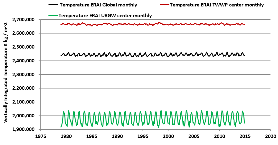
The featured chart is based purely on satellite reanalysis data, integrated across the full thickness of Earth’s atmosphere, over 36 years (432 months, from 1979 through 2014), for 3 samples. I didn’t modify this data in any way.
The black curve captures this temperature integration over time for the full globe. The other two curves capture temperatures from key locations in my recent paper [1]. The red curve details temperatures over the center of the TWWP (Trade Winds of the West Pacific) along the equator, and the green curve (URGW, Upper Rio Grande Watershed) traces the temperature history at a sample location within the Southern Rocky Mountains.
The temperature trends are flat. They are not rising over time. They are not falling over time. Yet there’s nothing controversial about this satellite data so far as I have ever heard. My guess is that climate change scientists wouldn’t publicly disagree that global temperature trends for the full atmosphere are flat. To the best of my knowledge, none have been asked.
When one reads climate change papers, it quickly becomes clear that their focus is on temperatures at Earth’s surface only, whether land or sea. Yet I think that if one is to be comprehensive about the global temperature-rising question/assertion, one should factor in temperatures throughout the full globe. That includes the full atmospheric thickness, and not only the surface. Moreover, one should examine the continuous whole-planet-coverage satellite reanalysis data, and not widely scattered, heterogeneous, non-uniform, human-error vulnerable, variable elevation temperature stations.
In any case, the surface temperature trend narrative does not add up. The greenhouse gases of climate concern don’t merely hug the surface, they circulate from the bottom to the top of our atmosphere. Moreover, their concentrations are never used by any meteorologist to predict the day’s temperature anywhere on the planet. And in any case, the atmosphere is mostly barotropic or baroclinic. In other words, for any given location, and particularly for the synoptic scale (1000 km), the temperatures at the surface are for the most part, highly correlated to the temperatures at any altitude above. So if one claims that temperatures at the surface are rising over decades, this should also be apparent for the full columns of air which press down upon the surface.
Think about it. Most other things being equal, the primary lever of surface temperature is pressure. Any weather person knows this. No scientist has asserted that added greenhouse gases are making the columns of air over our planet’s surface heavier. And it’s complementary to consider heat capacities of these volumes of air. Did you know that CO2 actually has a lower heat capacity than normal dry air? That means in macroscopic everyday terms that CO2 can’t store heat well at all. These questions would be a challenge to the consensus, but again to the best of my knowledge, such questions have never been posed (or at least responded to) in public.
And if some think that the layers of the atmosphere need to be shaken down and parsed and peeled before climate change can finally be revealed, please explain why climate scientists collect and stitch together temperature data from a wide range of surface elevations. I recognize that any land mass which has heights above a few hundreds of meters, penetrates through a number of those layers. In other words, the consensus climatologists do what I’ve done after a fashion. They combine temperature measurements from different atmospheric layers. They only happen to leave out most of the atmosphere.
Again, the featured chart above depicts temperatures for the full atmosphere thickness. It integrates the temperatures across about three dozen contiguous stacked atmospheric layers, from the surface to the top of the atmosphere*. The time series curves are surprisingly flat and thereby indicate that temperatures of the full atmosphere are not rising or falling over decadal time scales. There is no trend in this data. Furthermore such time series are not controversial. However that might simply be because little attention is ever drawn to them.
Also consider this animated map of 60-month-averaged temperatures across the Pacific and surroundings, from the same full-atmosphere-thickness data sets. Do you notice any change over time? I only see an occasional blip near my Southern Rocky Mountain study area, which is tied to some interesting conclusions found in [1] and having almost everything to do with solar cycles and atmospheric moisture circulation.
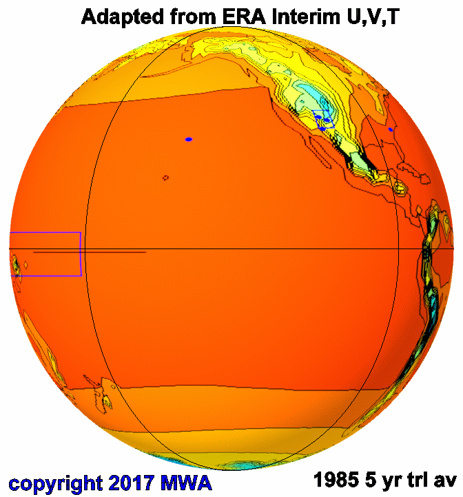
global temperature fluctuations 5 year trailing average several recent years A by mwa (CLICK TO ANIMATE)
I recognize that if one burrows into the climate change literature, one can find occasional references to a greenhouse-gas-spiked-atmosphere in which the surface warms more, as the tropopause cools. I believe that can’t be reconciled with the facts in a post I wrote a few years back, on Temperature, Moisture, and the Weight of the Atmosphere. The temperature inversion at the tropopause seems solely related to moisture condensation, and not to any greenhouse gases. And moisture is mainly the Sun’s plaything [1], not ours. On the other hand if their notion is true, then ultimately inversions at the tropopause should disappear entirely. That would be something.
Finally, the full atmosphere thickness is only a thousandth of the Earth’s radius. In this context it is like the skin of an apple. When one talks about the skin of an apple, do they really mean only and precisely the inner cellular layer of the skin that is in contact with the fruit? They most certainly mean the full skin, as I certainly mean the full atmosphere. The climate change scientists appear to mean something else.
Our atmosphere does have incredibly rich variations both in time and space and elevation. I along with numerous others study many of those parameters from integrated satellite perspectives, including atmospheric winds, moisture, divergence of latent heat, outgoing longwave radiation, geopotential height, and of course temperature. But as the chart and animation of this post help to introduce, temperature has the most uninteresting, least dynamic fluctuations of all. And the reasons should be clear to any meteorologist, atmospheric chemist, and/or hydrologist.
This is only an opinion piece and I’m simply asking questions, as any scientist must, especially in this climate change context.
POSTSCRIPT and PREVIEW
A few paragraphs back I mentioned the official climate change position that the stratosphere will cool as the troposphere will warm, all somehow due to greenhouse gases. I pointed to a suitable link, but that hardly begins to shed light on their interesting assertion.
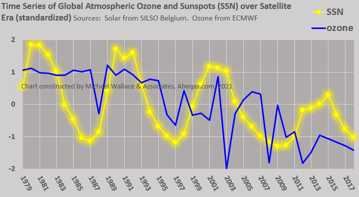
So as a preview of future work to come, I’ve added a composite figure below. The background image comes from Figure 7 of [2] and the foreground from [3]. I will venture that the quantitative correlation between the sunspot numbers and the stratospheric temperatures is quite high. There are some other references I will add but I note that the authors of [2] can hardly be bothered to recognize this solar connection, as they appear to favor the usual climate change suspects. This figure is also notable because not only the cycles but the TRENDS are in alignment. I never did favor de-trending of anything climate-wise and this is a good example of why one should not.

Accordingly, towards the explanation of stratospheric temperature trends, here is a perhaps novel alternative conceptual model to the Anthropogenic Greenhouse Gas – Ozone Hole – Volcanic Eruption – Ocean Heat Storage – Ocean Acidification-convoluted-IPCC-blessed notion: As solar forcing rises with each emergence into a sunspot number (SSN) peak, then as [1] describes, through the Clausius Clapeyron relationship, surface evaporation increases, moisture circulation in the atmosphere rises, and accordingly, more moisture reaches the stratosphere. The resulting condensation enhancement causes an increase in the temperature of the stratosphere. Naturally then, as solar forcing decreases with each descent from an SSN peak, then again as [1] describes, moisture circulation in the atmosphere decreases and the rest is left for the reader to quickly work out.
Finally readers are invited to visit the subsequent guest post on solar cycle correlations to precipitation and streamflow patterns in Europe. I’m not the only scientist who recognizes solar impacts over decadal timescales in the immediate world around us. Don’t simply take my word for anything. Study, question, challenge, and learn.
Data sources
UCAR ERAI Source: Available from http://www.cgd.ucar.edu/cas/catalog/newbudgets/index.html#ERBEFs
References
[1] Wallace, M.G., 2019, Application of lagged correlations between solar cycles and hydrosphere components towards sub-decadal forecasts of streamflows in the Western US. Hydrological Sciences Journal, Oxford UK Volume 64 Issue 2. doi: 10.1080/02626667.2019.
[2] Seidel, d.J., Gillett, N.P., Lanzante, J.R., Shine, K.P., and Thorne, P.W. 2011. Stratospheric temperature trends: our evolving understanding. Advanced Review. Volume 2, July/August 2011 John Wiley and Sons, Lt.d
[3] Source: WDC-SILSO, Royal Observatory of Belgium, Brussels
- The atmosphere can be subdivided into many more layers, or quite a few less, but the three dozen layers is the current convention.
 4537total visits,3visits today
You May Also Like